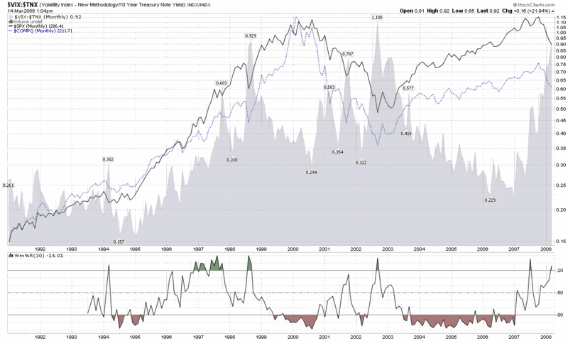
There are many ways of thinking about the current credit crisis, but today I thought I’d offer a visual depiction of one that I’m fairly certain has never been posted anywhere else. The chart below shows the ratio of the VIX to the yield on the 10 Year Treasury Note. By way of commentary, consider this to be a loose proxy for fear divided by the propensity of investors to flee to the safest investment alternatives. Needless to say, the graphic shows that the ratio is currently at levels seen only during extreme crisis or panic market environments.


No comments:
Post a Comment