Wednesday, February 17, 2010

Is The Second Leg Of The Credit Crisis Starting?

In an earlier post titled “CDS rates, What Is The Thermometer Telling Us?” [1] we said:

Sovereign default rates are moving higher across the globe. It underscores a concept we detailed in a recent Commentary [2] and Conference Call [3], namely the credit crisis was never solved. It was transformed from a reckless private sector borrowing binge to a reckless public sector borrowing binge.

Let us explain:

In the wake of the credit crisis we often talk of deleveraging. But how much has really taken place? The latest Flow of Funds [4] data can help shed some light on this.

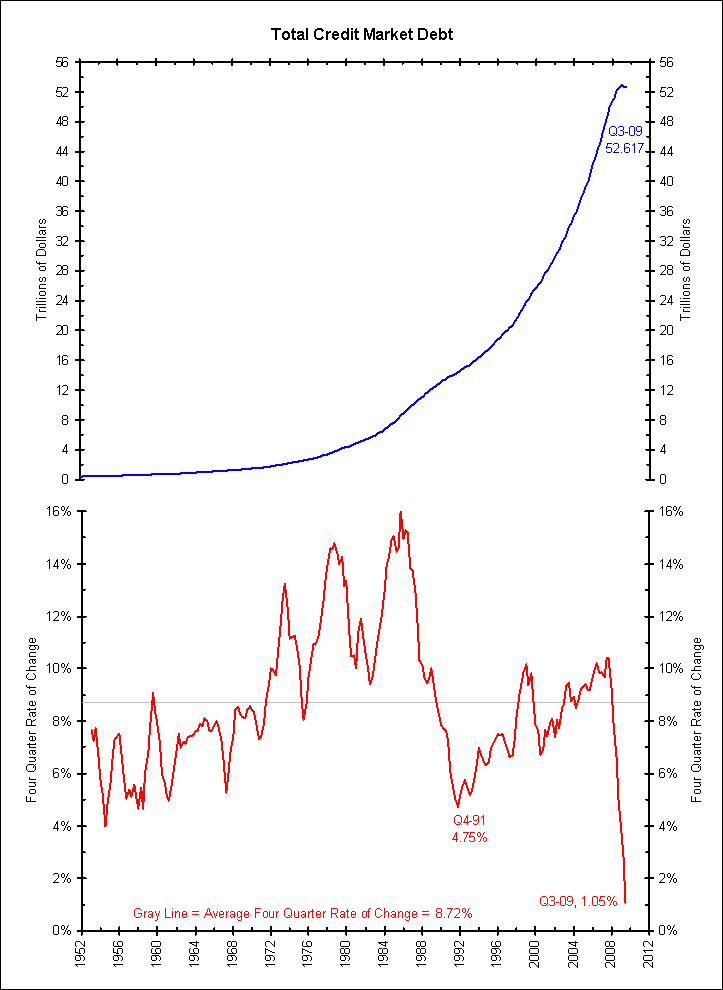
The first chart shows total credit market debt in blue on the top and its four-quarter rate of change below. As of Q3 2009, total debt stood at $52.617 trillion, growing 1.05% from one year earlier.

[5]

Deleveraging requires negative debt growth. Since the chart above shows total debt growth of 1.05% over the last year, this is not deleveraging. To be fair, it is the lowest growth since this series began in 1952, but it shows no sign of deleveraging.

Breaking down the series above, the next chart shows private credit market debt in the same format. Private credit is the total credit measure shown above minus Treasury, municipal, agency (including GSE-guaranteed MBS) and foreign debt.

[6]

This chart shows that the private sector is deleveraging. The total level of private sector debt is 3.80% lower than a year ago and negative for the first time since this series started in 1952.

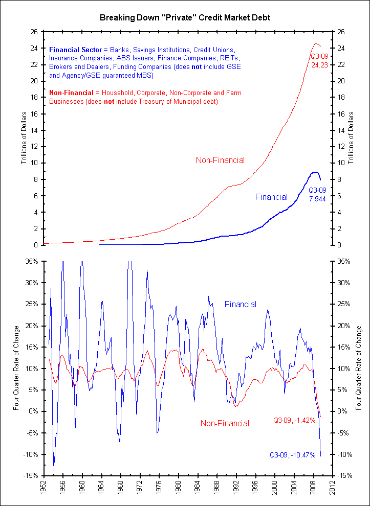
The next chart further breaks down private sector debt, showing financial and non-financial private debt. We find that virtually all the private sector deleveraging comes from the financial sector (blue lines), down 10.47% in the last year. The non-financial sector (red lines), which has borrowed more than 3 times times the financial sector, has barely deleveraged, down only 1.42% in the last year.

[7]

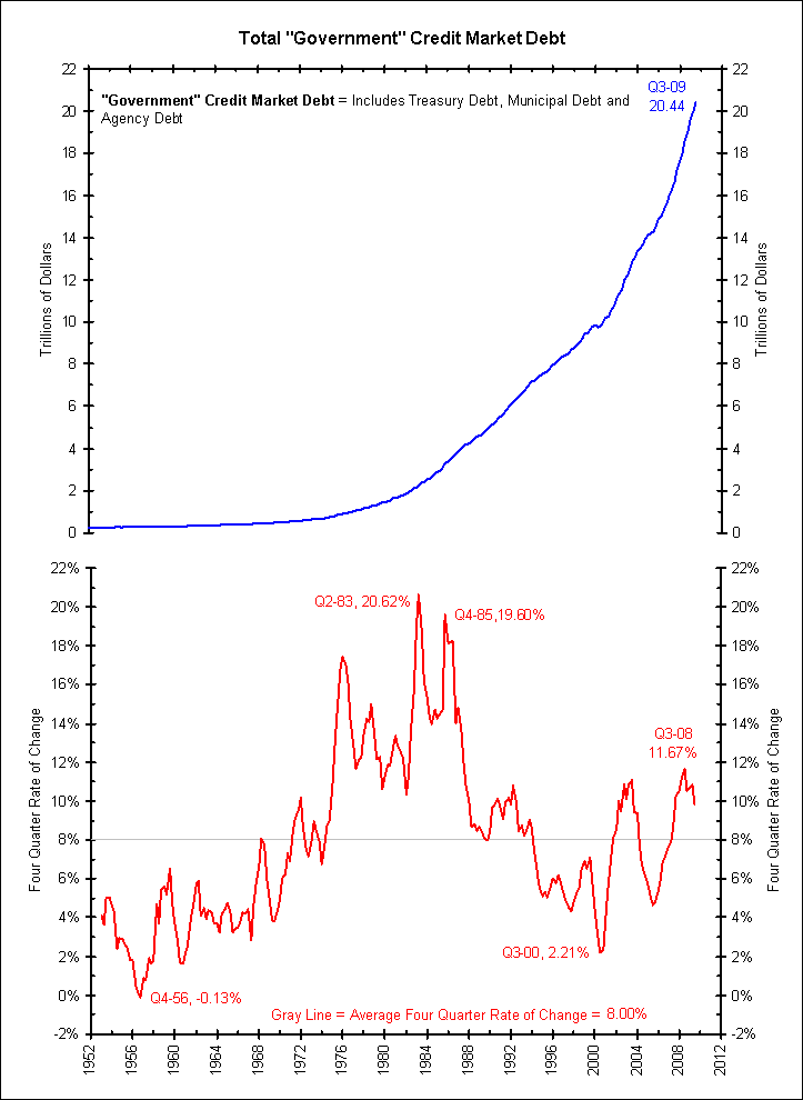
The final chart below shows total government debt. This includes Treasury, agency (including GSE-guaranteed MBS) and municipal debt. It is booming and currently stands 9.81% higher than it did 1 year ago. During the height of the crisis, Q3 2008, government debt levels were booming ahead at an 11.57% pace, a 20-year high. This is the opposite of deleveraging.

[8]

Conclusion

The “Great Recession” has essentially only resulted in deleveraging of the financial sector. The overall levels of debt are still rising, thanks to a very modest deleveraging of the non-financial sector and a big releveraging of the government sector.

Was the only problem that the financial sector was too leveraged? If so, the Great Recession returned the markets to sane debt levels. If not, then the government releveraging has prevented the correction and deleveraging needed to put the credit crisis firmly behind us. We fear the latter may be closer to the truth and the credit crisis is only partially complete. The next major deleveraging will occur in the government sector.

Is this what widening sovereign CDS rates are telling us?

China Sells Treasuries... or Did They?

Bloomberg (like every major media entity) reports:

China’s ownership of U.S. government debt fell in December by the most since 2000, allowing Japan to regain the position as the largest foreign holder of Treasury securities.

Japan’s holdings rose 1.5 percent in December to $768.8 billion while China’s dropped 4.3 percent to $755.4 billion, Treasury Department figures today showed. China allowed its short-term Treasury bills to mature and replaced them with a smaller amount of longer-term notes and bonds, the data showed.

China, with the world’s largest central bank reserves, may be moving money to other investments from the relative safety of Treasuries as the U.S. runs record budget deficits, economists said. China’s Treasury holdings peaked at $801.5 billion in May, and net sales in November and December were the first consecutive months of reductions since late 2007.


So Japan has passed China in total Treasury holdings.... or have they?

Looking at the above chart we see that the United Kingdom is listed as the third largest holder of Treasury bonds after the MASSIVE 12 month change seen below.


This is where I miss Brad Setser and his blog Follow the Money (he left blogging when he went to work for the White House). As he detailed back in the summer:
China tends to account for a very large share of purchases through the UK.

From mid-2006 to mid-2007, about 2/3s of the UK’s purchases of Treasuries were ultimately reassigned to China. I would expect the something similar is happening now — all of China’s bill holdings tend to appear in the US data in real time, but only a fraction of China’s long-term purchases tend to show up directly in the US data.
So (most of / some of?) these purchases by the United Kingdom were likely on behalf of China. Below is the last jump / reset cycle, though it is important to note that this cycle has happened on six occasions since 2002.


So has China stopped buying Treasuries? It doesn't appear so... yet.
More than any other time in history, we exist in a global platform that has permitted more people to plug and play, collaborate and compete, share knowledge and share work. But, the hidden hand and interlinked nature of the markets and economies almost never work without a hidden fist. A world as one has an upside and a potential downside as we have witnessed throughout the recession and most recently concerning Greece's sovereign debt issue.

"If you don't visit the bad neighborhoods, the bad neighborhoods are going to visit you."

-- Thomas Friedman

Back in 2005, Thomas Friedman wrote the international bestselling book, The World Is Flat: A Brief History of the Twenty-First Century, which analyzed the trend in globalization in the early twenty-first century. The title was a metaphor for viewing the world as a level playing field in terms of commerce, where all competitors have an equal opportunity. The title also alludes to the perceptual shift required for countries, companies and individuals to remain competitive in a global market where historical and geographical divisions are becoming increasingly irrelevant.

It is abundantly clear that, over time, the world's markets and businesses have become increasingly connected and interdependent. With advances in telecommunications infrastructure and the rise of the Internet, the process has been accelerating rather dramatically over the past 15 years as technological and financial innovations make it much easier for people around the globe to communicate, to travel and to participate in international commerce.

"No man is an island, entire of itself ... any man's death diminishes me, because I am involved in mankind; and therefore never send to know for whom the bell tolls; it tolls for thee."

-- John Donne

Interconnectivity in a linked world is not a novel concept. For example, from your high school days, you might recall the quotation above from late-sixteenth / early-seventeenth century English poet John Donne.

With the world growing smaller (and flatter!), U.S. financial institutions have been especially active in smelling opportunities outside our country. Whether, as suggested in Sunday's New York Times, Goldman Sachs (GS Quote) and other investment banks have exported the problems associated with financial derivatives or it was a byproduct of the search for yield as interest rates dropped to historic lows, the fact remains that the proliferation of unwieldy and unregulated financial derivatives around the world deepened the economic downturn, and it continues to produce financial aftershocks with unknown consequences.

I believe that Greece will be resolved and, in all likelihood, the solution will not be terribly disruptive to our markets. The situation is manageable and should be put into perspective. (John Mauldin has some interesting observations in his commentary this week.) The fiscal problems facing Greece will likely be bandaged over the next few months and, hopefully, will be resolved in the fullness of time through financial assistance, austerity and, ultimately, a more disciplined fiscal policy. Also, I believe that China's tightening was preemptive.

Nevertheless, we cannot paint over the far reach and potential problems associated with financial interconnectivity. My general feeling has been that many strategists are paying far too much attention to previous economic cycles (and traditional economic series) without fully recognizing the many new and nontraditional challenges to growth.

As Thomas Friedman wrote, most of our political elite don't understand that the world is flat, so the chances of policy mistakes loom larger.

Though our domestic fiscal problems are shallower than the problems over there, they still run deep. Contrary to the traditional view that gridlock is good for stocks, equities have been on the descent since Scott Brown's surprise Massachusetts Senate win.

The reasons for the weakness are multiple:

  • the likelihood that continued gridlock would fail to address our fiscal problems;
  • the lack of patience on the part of both Americans and our legislators/administration to do the right thing; and
  • that the odds favor inappropriate policy or weak policy to confront so many structural (nontraditional) imbalances and a number of other issues.

It remains different this time as over here and over there become interchangeable. Austerity, from the states of California and New York to the countries of Greece and Spain, remains a common theme that will detract from growth.

I emphatically reject the notion of those who see the current cycle as no different than the previous ones -- one that is and capable of dependable, smooth, self-sustaining and enduring growth (similar to the average of over 40 months). By contrast, I have argued (and continue to argue) that the aftershocks and deleveraging from the last steroid-aided credit cycle will have a long tail and will be with us for some time. The aftershocks will appear in numerous corners that will not only stunt economic growth but could produce headwinds to the benign consensus view of a shallow economic recovery. Under these circumstances, a lid is likely placed on P/E multiples.

In summary, we now must add the uncertainty of global connectivity (and the pesky critters that reside in dark and unknown corners) as a new influential factor to an already crowded list of unusual aftershocks that are byproducts of the earlier easy money credit cycle:

  • a multimillion phantom inventory of homes (over 7 million) that will disrupt the housing cycle over the next several years;
  • less credit available as the shadow-banking industry remains adrift and the securitization market is quiescent;
  • corporate profitability and the pattern of domestic economic will be more unpredictable and inconsistent;
  • disappointing organic sales growth;
  • with limited upside to stock and home prices, the aspirational consumer of the past few decades will demonstrate a renewed conservatism in spending and in savings;
  • a retrenchment in services and an increase in taxes at the state and local levels; and
  • confidence will remain subdued and, as a corollary, so will capital expenditures and employment growth be weak by historic standards.

While investors should continue to assign the highest probability to a benign and durable economic advance, a fine balance will be required to thread the needle and produce a smooth and self-sustaining world economic recovery. The foundation of growth remains shaky, and the risks of continued aftershocks and economically deflating policies (both in the U.S. and abroad) in a world so interconnected are simply too high to support a heavy commitment or above-average weighting to equities in 2010.

Tuesday, February 16, 2010

Five Little Known Secrets Of Ultra-Popular ETFs

Over the last year, a tremendous increase in the amount of ETF education has significantly reduced the likelihood of misuse by professional or amateur investors. By now, hopefully everyone knows that the United States Natural Gas Fund (UNG) doesn’t actually buy and hold natural gas and that USO’s underlying assets don’t include barrels of crude oil. But still, the research done by many ETF investors stops at the fund’s name, and perhaps a cursory look at the expense ratio. While the transparency and simplicity of most ETFs allow investors to get away with going light on the diligence, this doesn’t always hold true. Below, we take a look under the hoods of five ETFs to discover some surprising nuances about a number of exchange-traded funds.

5. The Truth About “Country-Specific” ETFs

The rise of the ETF industry has allegedly brought nearly every corner of the globe within reach of millions of investors. With country-specific funds targeting nearly every imaginable location, ETFs have been praised as a revolutionary new portfolio tool that allows investment in dozens of economies. Unfortunately, this is only half true. Most international ETFs are dominated by mega-cap companies that generate their revenues from around the world and just happen to be headquartered in a certain country. An investment in Toyota and Honda through a Japan ETF doesn’t provide exposure to the local Japanese economy, as these stocks be impacted more significantly by a change in U.S. consumer habits than economic growth in Japan.

The iShares MSCI Spain Index Fund (EWP) is a good example. Banco Santander and Telefonica, two of the largest publicly-traded Spanish companies, account for about 23% and 18% of EWP, respectively. Banco Santander generates only about 26% of its profit from Spain, with South America (36%) and the United Kingdom (16%) accounting for more than half of earnings. Less than 45% of Telefonica’s profit comes from Spain, as again Latin America (40%) and Europe (17%) account for significant portions of operations.

There’s nothing faulty or deceptive about international equity ETFs, but investors should be aware of the limitations imposed by the mega-cap focus, and the significant differences in risk and return profiles between these ETFs and small-cap international funds (as detailed in this analysis).

4. The “BRIC-HIC” ETF

Investors usually seek out BRIC ETFs as a way to gain exposure to four of the world’s fastest-growing emerging markets. So it may be a bit surprising that about 14% of the iShares MSCI BRIC Index Fund (BKF) is allocated to Hong Kong, recognized as a developed market by most major index providers and economists.

But BKF’s surprises don’t stop there.

Most investors recognize the BRIC bloc of countries as consisting of Brazil, Russia, India, and China, so they may be a bit perplexed as to why BKF maintains exposure to a different “IC” combo–Ireland and the Cayman Islands. The allocations to these countries are minor–less than 1% in aggregate–but a dilution of true emerging markets exposure nevertheless.

3. Muni Bond ETFs Push Quality Limits

Muni bond ETFs have become popular among investors in a high tax bracket looking to enhance their fixed income exposure. Historically, these funds have been made up of high quality, investment grade debt issues. But in the current environment, countless state and local governments are facing unprecedented budget shortfalls, resulting in slashes to discretionary expenses and increased debt burdens.

One of the side effects has been a widening disconnect between the target exposure of certain ETFs and their actual holdings. The PowerShares Insured National Municipal Bond Portfolio (PZA), for example, “is designed to track the performance of AAA-rated, insured, tax exempt, long-term debt publicly issued by U.S. states or their political subdivisions.” But about 12% of PZA’s holdings maintain a rating below AAA, with another 5% unrated.

The issue is even more pronounced among California muni bond ETFs. The PowerShares Insured California Municipal Bond Portfolio (PWZ) is “designed to track the performance of AAA-rated, insured, tax-exempt, long-term debt publicly issued by California or Puerto Rico or their political subdivisions,” but less than 60% of the underlying holdings are rated AAA.

The disconnect stated objective and the actual holdings of these ETFs highlights the importance of diligence when researching potential investments.

2. AGG: Pushing The Limits

The iShares Barclays Aggregate Bond Fund (AGG) is one of the most popular ways to achieve fixed income exposure through ETFs. The fund’s popularity stems in part from it’s reputation as a “one stop shop” for bond exposure, as it includes Treasuries, agency debt, and investment grade corporate bonds. The index underlying AGG consists of more than 8,000 individual holdings, making it one of the best barometers of the U.S. investment grade bond market.

The only problem is that AGG’s individual holdings number 276, meaning that it holds only about 3% of the issues that make up the Barclays Capital U.S. Aggregate Bond Index. Just as attempting to replicate the performance of the S&P 500 with 15 stocks would likely prove difficult, the managers of AGG face a tough task in replicating the benchmark’s performance with only a fraction of the total universe of debt issues. AGG is billed as a passively-indexed fund, but the process of selecting a handful of fixed income securities to match the risk and return characteristics of such a broad benchmark is more than somewhat reminiscent of active management.

1. Emerging Markets ETFs’ Dirty Little Secret

Most investors are shocked to learn that a significant portion of the assets held by two of the most popular emerging markets ETFs aren’t actually emerging markets stocks at all–at least according to certain authorities on the matter. The International Monetary Fund (IMF) has classified South Korea and Taiwan as developed economies for more than a decade, yet these countries receive two of the largest four allocations in both VWO and EEM. Israel was upgraded to developed status by the FTSE Group in 2007 and MSCI in 2009, yet still has a significant weighting in both funds. Perhaps the most perplexing inclusion is Hong Kong, which is recognized by all major index providers as a developed market but accounts for about 6% of EEM (Hong Kong equities aren’t included in VWO).

In aggregate, the developed markets of South Korea, Taiwan, Israel, and Hong Kong comprise about 34% of EEM and 27% of VWO, a significant dilution to the emerging markets exposure many investors expect. There is a “pure play” alternative to emerging markets exposure: the Dow Jones Emerging Markets Composite Titans Index Fund (EEG) is a BRIC-heavy fund that maintains exposure to 13 different emerging markets, none of which are the four quasi-developed markets that make up a big slice of EEM and VWO.
What up with the Hedge Funds of Funds Index last year? Theories abound.


Academics and researchers who study the hedge fund industry sometimes say that the best way to gauge the average performance of hedge funds is to look at an index of funds of funds (FoFs), not an index of hedge funds themselves. The funds of funds, the argument goes, contain many funds that do not report to any databases – and would therefore be missed by indexes of single hedge funds. In addition, an index of funds of funds is more diversified and is therefore a better representation of so-called “hedge fund beta.”

The HFRI Composite routinely shellacked the FoF Index in the 1990s. But since the turn of the century, the FoF index has generally exhibited performance that resembled the broader indexes – with lower volatility…

HFRI Fund of Funds Correlation 2b

While it may not look like it due to the absolute performance disparity between the two indexes, the FoF Index actually has a high correlation to the Composite Index…

HFRI Fund of Funds Correlation cYou can see this tight relationship in spades if you simply multiple each FoF Index monthly return by 1.4…

HFRI Fund of Funds Correlation 3b

So in a sense, the HFRI FoF is a deleveraged version of the Composite Index. Or, put another way: a portfolio containing roughly 66% Composite Index and 33% cash.

This tight relationship held up until last year when the HFRI FoF underperformed the HFRI Composite Index by a whopping 8.5%, even higher than 2003’s 7.9% under-performance (note that 2003, like 2009, was another barn-burner for the Composite Index.)

So what happened? Theories abound. Author and industry commentator Cathleen Rittereiser recently told Dow Jones:

“Arguably, funds of funds, could and should have reinvested their cash in hedge funds a lot earlier, especially if anecdotes are true that every fund in creation was open.”

Rittereiser is reflecting a common view of last year’s FoF under-performance – that funds of funds were sitting on mattresses full of cash they hoarded in case of massive withdrawals. This cash cushion apparently came back to haunt them.

A new study from Fitch Ratings backs up this hypothesis. The following chart from the firm’s recent Q1, 2010 Quarterly Hedge Fund Report shows that funds of funds actually performed in line with single hedge funds on a risk-adjusted basis. (If you draw a Capital Market Line between the HFRI Composite (green triangle) and, say, a 2% risk free rate, the FoF index isn’t really that far below it). (Click to enlarge chart)

funds of funds 1sm

Some say it wasn’t the mattresses full of cash that were the problems for FoFs, it was their return-chasing (or “safety-chasing”) behaviour. After watching global macro stay afloat in a stormy 2008, funds may have sought refuge in the strategy. Kristoffer Houlihan, Director of Risk Management at PAAMCO told the FT as much recently. According to the FT:

“…some managers sought refuge in global macro, a generally conservative, steady strategy. In 2008, global macro funds were off only fractionally, beating the industry average by more than 20 percentage points. This year, as of November, global macro has registered gains just north of 8 per cent, trailing the industry by 13.5 percentage points. The strategy delivered absolute returns, but in the context of the 2009 bull market its performance looked sluggish.”

Whatever the reason for last year’s anomaly, it will be very interesting to see if fund of funds indexes come back in line in 2010. Things are off to a good start. The difference between the HFRI Composite and the HFRI FoF Index in January: 1 bp.

Where to Hide?

Any concerns within broader credit markets need to start with sovereign risk (per The Star).

The sovereign debt crisis contagion is spreading in Southern Europe, from Greece to Portugal, Spain and Italy, where government debts and budget deficits are high.

Investors have sold government bonds in those countries as perceived default risks have risen.

This has resulted in the rise in the yields of government bonds resulting in higher borrowing costs for the government and private sector as loans are often tied to the risk free rate of government bonds.
But that is not where it ends.

Since the remarkable comeback across all risk sectors following 2008's collapse (the illiquidity in TIPS during the crisis made them trade among credit risk sectors), corporate bonds (both investment grade and high yield), agency mortgages, and even TIPS have been under pressure.


So if you can't hide in credit, TIPS, or mortgages, where can you hide and get more than 0%?

I have a few ideas, but would love everyone's thoughts...

Source: BarCap

Monday, February 15, 2010

Bad Timing Eats Away at Investor Returns

The ideal situation for most fund investors is a nice steady upward climb. This way, just about any point that you buy in is a good one and you get positive reinforcement, which will encourage you to invest more.

Unfortunately, the aughts didn't give you that. For the broad market indexes, there were four years of double-digit losses and four years of double-digit gains with two years of single-digit gains sprinkled in. Those severe reversals are tough on fund investors who tend to read a lot into recent performance. The past two years were particularly challenging. The bear market of 2008 led to mass redemptions of equity funds just as those equity funds were primed for their best year of the decade. Ouch.

We now have data on Morningstar Investor Returns for the full decade so that we can see just how investors did and learn some lessons that will help you make more out of your investments.

How Do We Calculate Morningstar Investor Returns?
Investor returns tell you how the average investor in a fund fared. We take monthly cash inflows and outflows and then calculate the returns earned on those flows. As with an internal rate of return calculation, investor return is the constant monthly rate of return that makes the beginning assets equal to the ending assets with all monthly cash flows accounted for. The gap between investor returns and total returns shows you how well investors timed their purchases and sales. (For all the details on the calculation, you can check out the two-page fact sheet here or the 10-page methodology document here.)

Mind That Gap
To see how the average investor did overall, we calculated asset-weighted investor returns and then compared them with the category averages. A couple of years ago, doing this revealed that the average investor often did better than the average fund because, while their timing was off, they often picked bigger lower-cost funds. However, the whipsaw of the past two years has meant that, in most categories and in the aggregate, investors have done worse than the average fund.

You can see the summary data in the table below. For the whole shmear, with data on all the individual categories, see this PDF.

Investor Returns in the Aughts

Category
Ast-Wgt 3yr Investor Return
Average 3yr Total Return
Ast-Wgt 5yr Investor Return
Average 5yr Total Return
Ast-Wgt 10yr Investor Return
Average 10yr Total Return
U.S. Equity Funds
-5.18
-4.96
0.64
0.91
0.22
1.59
Intl Equity Funds
-5.17
-4.55
3.27
5.23
2.64
3.15
Balanced
-2.15
-1.72
1.57
2.22
3.36
2.74
Alternative
2.36
-1.68
5.48
3.03
8.07
8.55
Taxable Bond
3.82
4.13
3.22
3.89
4.00
5.33
Municipal
1.01
2.50
1.45
3.02
2.96
4.57
All Funds
-2.71
-2.14
1.66
2.38
1.68
3.18
Data through 12/31/2009

The grand total for the average investor in all funds in the aughts was a 1.68% annualized return, compared with 3.18% for the average fund. The biggest gaps between investor returns and total returns were in municipal-bond funds, which returned 4.57% annualized. Investors only earned a 2.96% return. While the muni world's problems in 2008 got less attention than the stock meltdown, it was enough to lead some investors to redeem, only to see muni funds snap back in 2009.

In U.S. equities, the average investor earned a scant 0.22% annualized, compared with 1.59% for the average fund. As I noted above, two bear markets and two snap-back rallies made for a really challenging time for many fund investors.

Interestingly, balanced fund investors did manage to beat the averages. They earned a 3.36% annualized return, compared with 2.74% for the average fund. A mix of bonds and stocks leads to moderate results, and more investors stick with these funds through the down periods. In theory, it shouldn't matter if you hold a stock fund and a bond fund separately or get the same exposure through an allocation fund, but in practice it seems that boring balanced funds don't push fear or greed buttons that throw people off. As Jack Bogle says, emotion is the enemy of the investor.

Looking at individual categories, there were some interesting cases of investors beating category averages. In the five foreign style categories (foreign large-growth, etc.) investors beat the averages in some cases by a wide margin. It may be because big funds such as American Funds EuroPacific (AEPGX) and Vanguard Total International Stock Index (VGTSX) have much lower fees than the average fund in these rather pricey categories and produced strong performance. It could also be that foreign funds' superior returns prior to 2008 led investors to keep the faith through the bear market.

Not everything was peachy overseas. The average global real estate fund returned an annualized 10.74%, but the average investor gained about 0.65%.

How to Be on the Right Side of the Gap
While some investors tend to make mistakes by reading too much into recent performance and letting fear and greed prod them into making a bad situation worse, there's no reason you have to do the same. Here are a few suggestions for improving your portfolio performance.

• Go back over your past statements and look at how funds did after you sold them. If you tended to sell at the wrong time, try to steer clear of higher-risk funds that led you to make those decisions. You can do this by reviewing all of the fund's calendar-year returns as well as its Morningstar Risk rating. Maybe instead of a hot regional fund, for example, you should buy a balanced fund for your next investment.

• Write down your planned holding period for each fund and the goal you are trying to reach. Another reason that people panic amid sell-offs is that they have a mismatch of investments with their goals. If you need the money in three years, don't put it in a stock fund. However, if you need it in 20 years, don't abandon your plan because you lost money in year two.

• Evaluate a fund's performance over a manager's entire tenure rather than reading too much into a single year's returns. Short-term returns are very noisy--it's only the long term that lets you evaluate a manager's skill.

• Consider valuations of your fund's holdings. Because rallies and sell-offs are often overdone, fund portfolios tend to be real bargains after a long sell-off and rather unattractive investments after a long rally. This is how fund managers think. They're looking through the windshield rather than the rearview.

Junk Bond Spreads Widening: A Canary in the Coal Mine?

As readers no doubt know all too well, the market premium versus safer ones contracts in robust times and widens in downturns. And since credit markets typically signal downturns months before the equity markets, junk bonds are one place to look for advance warnings of changes in economic fortunes (albeit with a risk of false positives).

The Financial Times reports (hat tip reader Joe C) that sovereign debt worries are leading investors to exit junk bonds at a particularly rapid clip:

Investors are selling out of “junk” bonds at the fastest rate since September 2005, in the latest indication that concerns over sovereign debt are spreading to other credit markets.

In the week that ended on Wednesday, nearly $1bn was withdrawn from US funds that hold high-yield corporate bonds (junk bonds), according to Lipper FMI – the largest outflow in almost four and a half years.

As a result, the past month has seen the biggest sell-off of US junk bonds since the equity market bottomed out in March 2009, said Martin Fridson, chief executive of Fridson Investment Advisors, which specialises in high-yield bonds.

Spreads – the difference between the yields on junk bonds compared with US Treasury bonds – have widened by more than 100 basis points since January 11, and now stand at about 700 basis points, as measured by the Bank of America Merrill Lynch Index.

Monday, February 08, 2010

Kass: Greed Might Get Good Again

Doug Kass

02/05/10 - 02:00 PM EST
This blog post originally appeared on RealMoney Silver on Feb. 5 at 8:12 a.m. EST.

"I have recently written that before we write Dubai off as a unique situation, there is never one cockroach as the egregious use of debt over the last decade has a long tail to it. I remain skeptical of the consensus view that Dubai is a one-off, unique situation that resembles nothing else in the world. Dubai is not sui generis. Last week I wrote that Austria's Credit Anstalt failed in 1931 and that it, too, was initially ignored. History steadily provides us with examples that contagions can begin in the most remote of places. When I wrote about the meaning of the Dubai credit mess last week, I specifically highlighted the problems in Greece: 'Investors are ignoring some of those nasty critters in Spain and Greece, and don't forget the typical bedbugs in Latvia and in the Ukraine.'"

-- Doug Kass, "A Couple of Concerns" (Dec. 9, 2009)

I have expressed my doubts that the domestic economy began a normal cyclical expansion in the spring of 2009 that is capable of matching past recoveries of over 40 months in duration. I strongly disagree with this conclusion as the past cycle was not a traditional cycle. Rather it was an unprecedented credit-driven cycle characterized by an excessive and abusive use of debt/leverage at nearly every level of the private and public sectors. Following the artificiality and unusual nature of the last ("free") credit cycle, the current expansion, which is now deprived of much of the steroids that formed the foundation of that growth, seems likely to disappoint an increasingly confident cabal of forecasters who project a smooth and self-sustaining recovery.

Moreover, I have submitted that the credit aftershock of the last cycle would have a long tail and would likely continue to haunt the economy and limit economic growth. For example, state and local governments and even countries outside the U.S. should no longer be steady contributors to growth as they have been in prior recoveries. Instead they face the dual challenges of extended balance sheets and an imbalance between receipts/expenses and imports/exports.

As well, I have argued that the securitization markets and the shadow-banking industry, omnipresent in the last cycle, would not be the same driver to growth going forward. Not only will housing, the consumer and small businesses suffer from less available credit, but so will large companies that had previously relied on the (healthy) securitization markets to finance their own growth by laying off receivables to others.

Back in December, I turned my pen to concerns about country risk (above) and the risk of contagion -- the cockroach theory was readily dismissed by many as world equity prices continued to advance amid signs of a statistical economic recovery, but in Thursday's trading, sovereign risk (especially of a Greek kind) was front and center.

Make no mistake, the problems are real, and they will be felt by the inhabitants of the exposed countries and by the holders of their debt. How the drama unfolds and whether the European Monetary Union will halt the potential contagion by issuing an E.U. debt guarantee, providing loans or easing collateral rules remains to be seen.

Nevertheless, the size of the problems in Greece, Portugal and the other nasty critters must be put in perspective. Greek's GDP, at only $343 billion, is roughly equivalent to the GDP of the state of Washington in the U.S. The GDP of Portugal is even smaller; at $223 billion, it is equivalent to the GDP of the state of Louisiana. According to Mike O'Rourke, Greece's total stock market valuation is "slightly more than Citigroup's (C Quote)." And, if you add the GDP of Greece and Portugal together, "they will equal the size of one large systemic institution in the United States."

For these reasons and others, I view the yesterday's panic as a likely nearing of the end to the market's correction rather than the beginning of a much larger selloff or bear market.

It will soon be time to be greedy when others are fearful.

Up In Smoke: One Third of the Gains Since the Start of 2009

It may be hard to belive, but 35% of the S&P 500's gains since the start of 2009 have now been erased over a span of less than 14 trading days. After gaining 247 points in 2009 and the first two and a half weeks of 2010, the S&P 500 has dropped 86 points since its January 19th peak of 1,150.

Monday, February 01, 2010

Where’s the Bubble: Stocks or Bonds?

Kate Welling does great interviews. (I spoke with her in June of 2009 [1]). A few weeks ago, she interviewed Michael Belkin, who is not well known to the public, but is widely respected by the institutional side. To understand why, see our Quote of the Day [2] from July 29th, 2008.

Belkin points out that, despite what so many people claim, following the freefall last year, the bubble is not in stocks. And as we have shown previously [3], after major secular bear markets, you should expect a substantial bounce.

The bubble, Belkin argues persuasively, is in bonds. QE policies driving rates to zero percent, and despite the low rates, investors have poured cash into bonds.

Here’s a brief excerpt:

Where my views are probably different than what some of the higher profile names are currently saying is that I’m not pointing to the equity market now as the source of a bubble or of malinvestment, in Austrian terms.

If not the stock market, where are you pointing?

At the bond market. Specifically, since the March 20, 2009 turning point in the equities market, if you look at the AMG weekly data on inflows into ETFs and mutual funds,bond fund flows have been positive every week and have averaged $4 billion a week. There hasn’t been a single down week. But meanwhile, for equities funds, there’s been a completely different pattern. They’ve been down two weeks, up one week, then down, up four weeks, down five weeks —and the average inflow is only $500 million a week.

Just barely positive?

Yes, at last count only $24 billion had gone into all kinds of equities funds over this entire
recovery rally, versus $178 billion into bond funds. I’ve been looking at this for quite a while
and sort of scratching my head and wondering what was going on. But finally it just occurred
to me. They’re buying bonds. It’s rather obvious. I think what has happened is that the thepublic in previous cycles bought emerging market funds or internet stocks or whatever, when the Fed would lower interest rates to an artificially low level, thereby penalizing people on their savings. So right now, for instance, I have friends who inherited a lot of money and I’m an informal advisor to them, not a paid advisor. They keep asking me, what do I do now? They were investing in CDs, that were parceled out to a lot of different banks on which they were making 2, 3, 4%. But now they’re maturing and the banks are offering, like, nothing. So they are asking, what do we do, what do we do? They need the yield; they need income; they don’t want to lose the nominal principal. What to do? What to do?

Belkin’s time series regression analysis analysis is not only data driven, but he is alsoaware of historical predecessors. I find his argument that Bonds are at greater risk than stocks to bevery counter-intuitive, contrary — and compelling.

>

US Fund Inflows From Market Bottom Mar 2009-Now

[4]

>
Source:
Still Bullish
listeningin VOLUME 12, ISSUE 2
Weedon@Welling, JANUARY 22, 2010
http://welling.weedenco.com/

Small not always beautiful

I have some bad news for you if you are a big fan of small-cap stocks over large-caps:

Your seasonally favorable time is almost over. It lasts just until the end of this week, in fact.

That's because, from February through December, small cap stocks historically have performed no better than large caps.

This no doubt will come as a shock to those of you who in the past have confidently favored small-cap stocks because of their strong academic seal of approval. Many can point to the famous Ibbotson data, memorialized annually in their famous yearbooks, which consistently have shown that small-caps have enjoyed a strong margin of victory over large-caps, all the way back to 1926.

But there is one crucial feature of that data that has received far less attention: Virtually all of the small-caps' margin of victory is attributable to the month of January alone.

To document this, I turned to the monthly data on the performance of small- and large-caps calculated by Eugene Fama and Kenneth French, finance professors at the University of Chicago and Dartmouth, respectively. Their dataset shows that, cumulatively since 1926 for all non-January months, the 50% of stocks with the smallest market caps have slightly underperformed the 50% of stocks with the largest market caps.

What this means: If you're a small-cap investor, the historical odds are almost exclusively concentrated during the month of January alone. While the small-cap stocks that you own might still outperform the market during the other 11 months of the year, it won't be because of any historical precedents in their favor.

While one could equally draw this lesson of history in any year, it is especially important to draw it now, given how overvalued small-cap stocks in general appear to be, relative to large-cap stocks.

I owe this insight to Jeremy Grantham, the chief investment strategist at GMO. For several months he has been arguing that, in the wake of the extraordinary performance of the smallest-cap stocks since last March's market lows, it is far safer now to bet on the large-caps.

The bottom line? You should invest in a small-cap stock only because you believe it is fundamentally a sound investment. Your rationale for investing in it should not be that it is a small-cap.

Lunch is for wimps

Lunch is for wimps
It's not a question of enough, pal. It's a zero sum game, somebody wins, somebody loses. Money itself isn't lost or made, it's simply transferred from one perception to another.