Thursday, July 29, 2010

Got Yield?


A month back I detailed that the aggregate bond index (i.e. the Barclays Capital Aggregate made up mainly of Treasuries, Corporates, and Agency MBS) hit an all-time low yield of 2.94%. One month later that looks lofty as the yield to worst hit 2.71%.

Aggregate Bond Index YTW by Sub-Sector


Source: Barclays Capital

Wednesday, July 21, 2010

Is someone liquidating GLD?

In the old(er) days, it was generally said that gold traded in an inverse relationship with the dollar and also, to a lesser extent, other risky assets.
Yet, gold sold off sharply in June:


But the S&P 500 also saw a fall:

And the dollar has also been declining:

Which might be a tad confusing.
So what’s really behind the gold move?
Well, according to Reuters one particular equitised gold product is experiencing rather sharpish outflows in holdings. That would, of course, be the SPDR GLD exchange traded fund (ETF).
As the newswire reported on Tuesday:
The world’s largest gold-backed exchange-traded fund, SPDR Gold Trust said its holdings fell nearly 0.5 percent to 1,308.128 tonnes by July 20 from 1,314.211 on July 15. The holdings hit a record at 1,320.436 tonnes on June 29.
To see how that ties with the gold price one would have to chart GLD’s historical assets under management or shares outstanding. Unfortunately, the GLD SPDR goldshares’s website doesn’t offer archived data on this, only the last noted assessment.
So we’ve done the next best thing.
Thanks to a previous enquiry, we had data up until end-of-May and have updated the chart with the latest shares outstanding figure from the website. Here’s how it looks:

Of course, there might be a perfectly reasonable explanation for that drop.
Some have noted, for example, that iShares’ competing gold product (IAU) slashed its management fees this month in a bid to woo other assets. As IndexUniverse observed:
Did IAU Just Steal $59 Million From GLD?
It’s too early to call it a trend, but it’s tempting to see one after ETF-share creations last Friday on iShares’ Comex Gold Trust (NYSEArca: IAU) fund were virtually identical to redemptions on State Streets’ SPDR Gold Shares ETF (NYSEArca: GLD).
Net flows into the iShares ETF on July 9 were $59.2 million, a 2 percent increase, which raised total assets after market movement to $3.47 billion, according to data compiled by IndexUniverse.com. Outflows from GLD were $59.1 million, a tiny setback for the second-biggest U.S. ETF, which has more than $51 billion in assets.
The movements came about a week after iShares slashed the price of its gold fund, moving the annual expense ratio from 0.40 percent to 0.25 percent on July 1.
And here’s how IAU’s shares outstanding compare:

Of course, that still doesn’t really explain the impact on the gold price . . .

Rogue Waves and Hedge Fund Returns

How exposed are hedge funds to “rogue” correlations, wherein returns of assets or asset classes that normally exhibit hedging cancellation instead exhibit hedge-killing reinforcement? In the June 2010 version of their paper entitled “‘When There Is No Place to Hide’: Correlation Risk and the Cross-Section of Hedge Fund Returns”, Andrea Buraschi, Robert Kosowski and Fabio Trojani investigate the exposure of hedge funds to correlation risk (risk of unexpected changes in the correlation between the returns of different assets or asset classes) and the implications of this risk for hedge fund returns. Using data for actual one-month-to-maturity  S&P 500 correlation swaps (based on daily implied versus realized correlation), individual S&P 500 stock and index put and call options and a broad sample of 8,710 individual hedge funds spanning in combination January 1996 through December 2008, they find that:
  • Rogue correlations tend to occur during market crashes or periods of economic crisis.
  • The correlation risk premium over the entire sample period averages -14.3% per month, but declines over time (see the chart below). The bulk of the option-implied variance risk premium apparently derives from correlation risk.
  • Because they seek to exploit correlation to dampen aggregate return volatility, hedge funds generally impound correlation risk. Adjusting for correlation risk (after adjusting for seven other commonly used hedge fund risk factors) reduces the alpha of a broad value-weighted hedge fund index from 5.36% to 3.47%.
  • Correlation risk exposures are particularly high for Long/Short Equity, Option Trader, Merger Arbitrage and Multi-Strategy hedge funds. Adjusting for correlation risk (after adjusting for the seven other factors) reduces the alpha of a value-weighted index of these low net market exposure funds from 13.7% to 4.25%.
  • Adding a correlation risk factor to a seven-factor hedge fund return model increases the model’s ability to explain hedge fund returns from 10.5% to 17.7%.
  • Funds with large negative correlation risk exposures tend to have high returns. The tenth of hedge funds with the most negative correlation risk exposures (implicitly selling insurance against unexpected increases in correlations) have an average raw annualized return of 13.4% and a seven-factor alpha of 8.9%. However, correlation risk explains over 10% of the 13.4% return.
  • Correlation risk exposure strongly affects hedge fund return distribution tail behavior and maximum drawdown. The typical maximum drawdown for the tenth of hedge funds with the largest negative correlation risk exposures are nearly three times bigger than the typical drawdown of the tenth of funds with the largest positive correlation risk exposure.
  • Results are robust to use of alternative databases, equal weighting instead of value weighting and inclusion of liquidity factors.
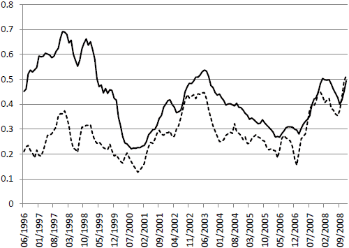
The following chart, taken from the paper, shows the six-month moving average of the implied correlation (solid line) and the realized correlation (dashed line) derived from actual and modeled correlation swap quotes. The correlation risk premium (derived from realized minus implied) is persistently negative but generally declining in magnitude over time. Expanding use of strategies seeking to exploit the premium may be compressing it.

In summary, evidence indicates that hedge funds with low net market exposure may earn returns largely by assuming that correlations between assets and asset classes will behave predictably, and rogue correlation spikes may swamp these funds with extremely large drawdowns.

Lowest 10-Year Inflation Rate in Forty Years...

...at least according to the government.  In last Friday's release of the CPI, the ten-year change in consumer prices dropped to its lowest level in over forty years.  Over the last ten years the CPI has risen 25.97%.  The chart below shows the rolling ten-year change in the CPI.  Not since June 1969 has the ten-year rate of change been this low.

MID-MONTH PERFORMANCE UPDATE FOR THE MAJOR ASSET CLASSES

Misery loves company, but returns for the major asset classes show no sign of wear this month from the economic worries of late. If anything, the chatter about deflation and the potential for a double-dip recession has emboldened the bulls in July. Save for TIPS, prices are higher across the board, and by more than trivial amounts for most broadly defined asset classes

Indeed, it's been a strong month for gains through July 19. There's no assurance that the advances will hold up through the end of the month, when we publish our strategic monthly recap (the last one was published here). In fact, there's a good case for expecting a tactical retreat, or at least a downshift in the buying. Meantime, the year-to-date tallies look impressive. Perhaps it's fair to say that the crowd has been willing and able to climb a wall of worry.
072010a.GIF
Foreign stocks are the big winners so far in July--equity markets in developed market nations in particular. Vanguard Europe Pacific ETF (VEA) closed yesterday with a gain of more than 7% for the month so far, the clear leader among our ETF proxies for the major asset classes. The rest of the world's stock markets aren't doing so bad either. In the U.S., equities have climbed nearly 4%, based on Vanguard Total Stock Market ETF (VTI).

Overall, July has been a powerful month for returns, as shown by the 3.9% price gain so far in July for the Global Market Index, a passive mix of all the major asset classes weighted by market value. As returns for this benchmark go, that's an impressive run over such a short period. The pace won't last, of course. But for the time being, there's a strong tailwind blowing all the major betas higher.
The issue is one of deciding whether a) the markets correctly sense a better-than-expected future in the months ahead; or b) the speculators have gone off the deep end in recent weeks. It's clear why bond prices might run higher. If investors are worried about economic weakness and deflation, rushing into the safe haven of fixed income has obvious appeal. But why the simultaneous surge in demand for risky assets in recent weeks? Is the economic future a good deal brighter than it appears? Or have the optimists run ahead of reality once again?

Are Top-Line Worries Overblown?

The recent commentary coming out of talking heads has been that weak top-line numbers this earnings season have been a main culprit for the declines we've seen since the reporting period began last Monday.  The actual numbers dispute this argument.  So far this earnings season, 73% of companies have beaten their top-line revenue estimates.  As shown below, 73% is at the high end of the range seen during quarterly earnings seasons going back to 1999.  The average revenue beat rate since then has been 62%.

Maybe recency bias is involved.  On top of the argument that revenue numbers have been weak for the entire market, many of the guests on the various business channels today are arguing that revenue numbers in the technology sector have been really bad.  Sure, revenue numbers did come in weaker than expected for the two major tech companies that reported yesterday after the close (TXN & IBM), but prior to that, not one tech company had missed revenue estimates this earnings season!  As shown below, thirteen tech companies have beaten revenue estimates this season, while three have missed.  When Intel reported blowout numbers last week, all was good in the world.  Now all is bad in the world.  As mentioned earlier, the revenue beat rate is currently at 73% -- 11 percentage points above the historical average.  If it declines to the historical average over the next couple of weeks, then there is cause for concern.  But for now, one day of bad numbers does not make an earnings season trend, so don't buy into the top-line worries just yet.

Monday, July 19, 2010

Time horizons and market correlations

Given our interest in the potential for a “forthcoming golden age of stock picking” we wanted to highlight a couple of posts that highlight the current state of the markets.  At least on the country selection front there is a ray of hope for active managers.

Bill Hester at Hussman Funds* notes how in the global equity markets there is a growing spread in country returns.  Thereby making country picking strategies potentially more lucrative. He writes:
More recently through 2007 the divergence in stock market returns among developed countries collapsed. There was very little value in making distinctions at the country level when individual country returns were so tightly centered about broad benchmark return levels.  These trends have shifted the last couple of years and the recent spread between relative performances continues to widen.
He notes that some of this divergence has to do with the relative concentration of the banking sector on index returns.  The guys at Systematic Relative Strength chime in thusly:
The greater the dispersion in returns, the more likely relative strength is to be able to deliver superior performance over a benchmark index fund. If we do indeed see much greater divergence in country returns going forward, relative strength is well-positioned to capitalize.
The general point being that as relative economic performance diverges across the world we should expect to see some continued divergence in country returns.  Relative strength being one method to take advantage.
On the domestic front, there is little in the way of divergence.  Today Zero Hedge highlights some research showing a continued increase in cross-equity correlations.  In short, stocks are moving more and more alike these days. They quote Matt Rothman of Barclays:
To belabor the obvious and put this in perspective, current levels of correlation are higher than in October 1987, anytime during the Fall of 2008, either the run-up or the bursting of the Internet Bubble, or after 9/11. The reason this matters to all stock pickers — fundamental or quantitative — is because with stock return dispersions at all-time lows, it is extraordinarily difficult to be picking stocks.
One can argue whether that has do more with the macroeconomic situation or the rise of high-frequency trading.  We would add increasing interest in sector ETFs as another contributing factor, as well.  One would think that at some point this trend will reverse.
This could come through an adverse market event, as ZH surmises, or from the renewal of a bull market.  In either case, stock selection would once again come to the fore.  Individuals can’t trade like high frequency traders or proprietary trading desks. By necessity individuals need to have a longer time horizon than these market players.  Therein lies the opportunity for dedicated investors.

Highest Single Stock Correlation with S&P500 Since ‘87 : Is Alpha becoming Beta?

Is Alpha becoming Beta?


That seems to be the case lately, with a very high correlation between stocks.The WSJ noted the sync between individual names in Component Stocks’ Correlation to S&P 500 at Highest Level Since ‘87 Crash.
Hence, it is not really a “stock pickers market,” as so many know-nothing pundits are trying to tell you.
Jim Bianco blames “Macro Investing” — between ETFs, program trading, and other factors, this leads to increasing degrees of correlation.

I think its more of a sign of indecision, and traders sitting on their hands.

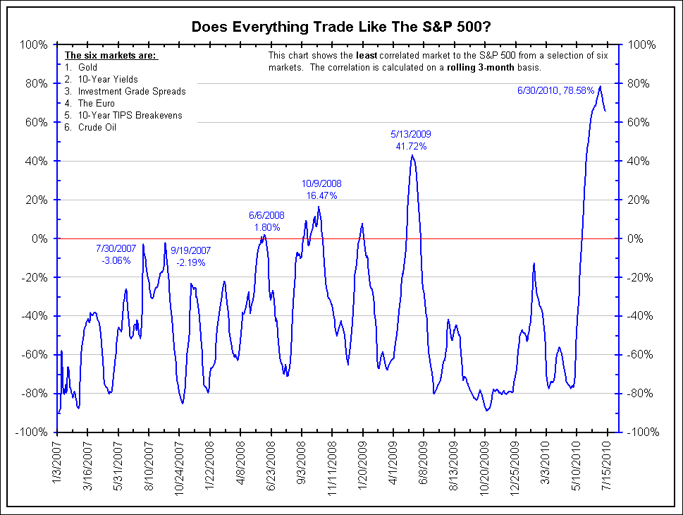
Here is Jim’s chart, showing the correlation between 6 other markets that are trading like SPX:
>
click for bigger chart

chart courtesy of Bianco Research

Wednesday, July 07, 2010

Alpha Is Dead: Barclays Says With Stock Dispersion At All Time Lows, It Is "Not A Stock Pickers' Market"


There is a simple reason why all hedge funds with "relative value" or "deep value" in their names will soon be looking to change their moniker: stock picking no longer works, with the only strategy that matters, as implied correlation is now at the second highest level in history, is picking the time to leverage beta exposure and riding the broader market up or down. Alpha is now dead. as Barclay's head of quantitative strategies Matt Rothman says, "Indeed, it was hard to be a stock picker in the market for the last two months as the last two months have seen historically low levels of dispersion in stock returns. As shown in Figure 2, the cross-sectional correlation across all stocks in the market was at its second highest level last month (measured back to July 1950) and recorded its third highest level this month; there have never been to two months back-to-back with anything approaching these levels. To belabor the obvious and put this in perspective, current levels of correlation are higher than in October 1987, anytime during the Fall of 2008, either therun-up or the bursting of the Internet Bubble, or after 9/11. The reason this matters to all stock pickers — fundamental or quantitative — is because with stock return dispersions at all-time lows, it is extraordinarily difficult to be picking stocks." In other words, the danger of yet another systemic meltdown (or up), now that everyone is on the same side of the trade (and whoever isn't, is getting steamrolled), is higher than ever in history, up to and including May 6. And he, who has the greatest access to (risk free) leverage wins. Therefore look for all the "investment bank" hedge funds with prop desks and discount window access to once again post record trading days for the current and all future quarters until even they blow themselves up eventually and the Fed can do nothing to prevent it.
Full market commentary from Matt Rothman:
For us, this month was not so different from last month. Our models continued to work, marking two straight months of solid out-performance, ending our long spirit-crushing dry spell of underperformance. The broad market averages maintained their downward trajectory as investors continue to worry about the engines for future growth with implications from currency markets and various fixed income markets all leaking into the equities market. And so once again, it turned out to be all about quality.

This was good news for our portfolios – and for most practioners of quantitative stock picking – since our quantitative models give us positive exposure to the styles of investing that the market has been rewarding recently. Our models are built to gain consistent exposure to cheap high-quality companies with positive sentiment. In general, we like companies that are attractive on an earnings yield or free-cash-flow basis with strong historical profitability, improving margins and repeatable earnings that are also are being acknowledged by the market as having room to run through strong price momentum and improving earnings forecasts. Now, of course, it is high unlikely for any one company to have all of these characteristics going in their favor at any one moment in time, so our model is a way of picking and choosing stocks that come the closest to having it all. Moreover, not all of the characteristics described above are all positively rewarded by the market at any specific time.

What is noteworthy is that in recent months all three basic investment styles have all been working well. Cheap companies are outperforming expensive companies. High Quality companies are outperforming Low Quality companies. And companies with positive Market Sentiment have been outperforming companies with poor Market Sentiment. This lead to the relatively strong performance by our Quantitative models. In our long-only portfolio, 62.4% of our stocks beat their Russell 1000 benchmark. In the long-short portfolio, 66.8% of the longs beat the Russell 1000 and 47.2% of the shorts trailed the Russell 1000, for a combined stock selection hit rate of 57.1%. Last month, stock selection was strong for our model because the styles we liked were rewarded.

Let’s be clear, though, that this is not the same thing as saying this was a “stock picker’s market”. Indeed, it was hard to be a stock picker in the market for the last two months as the last two months have seen historically low levels of dispersion in stock returns. As shown in Figure 2, the cross-sectional correlation across all stocks in the market was at its second highest level last month (measured back to July 1950) and recorded its third highest level this month; there have never been to two months back-to-back with anything approaching these levels.1 To belabor the obvious and put this in perspective, current levels of correlation are higher than in October 1987, anytime during the Fall of 2008, either the run-up or the bursting of the Internet Bubble, or after 9/11. This observation holds across sectors, with the correlation of stocks within Materials, Industrials, Consumer Discretionary, Consumer Staples, Health Care, Financials, Technology and Utilities sectors all being at or very near historical highs.

The reason this matters to all stock pickers — fundamental or quantitative — is because with stock return dispersions at all-time lows, it is extraordinarily difficult to be picking stocks. The decisions that matters are related to style selection not stock selection. We are fortunate because the styles favored by our Quantitative model (Quality, Value and Sentiment) are being favored by the market. Clearly, the current levels of cross-sectional correlation are unlikely to be sustained and we fully expect to see them revert to their more normal levels in relatively short-order (weeks to months). Just as cross-sectional stock correlations converge towards 1 as markets falter, they tend to dissipate as markets rally. But we believe it would be unwise to read the chart above as a reason to think that a market rebound is due in immediate future. For example, market cross-sectional correlations remained highly elevated throughout the Fall of 2008 and first three months of 2009 (at levels above 50%) and came all the way in as the markets rallied. But we certainly do not believe that what sent the market rallying on March 9th, 2009 was not the unsustainable level of cross-sectional stock correlations. Rather, we hold it was a combination of wise and coordinated monetary and fiscal policies by governments and central bankers across the globe. Hence, we believe this is an interesting contemporaneous indicator about the current state of the market but it is ill-suited as a leading indicator of where the market is headed.

High Yield Spreads

High-yield bond spreads are used by many investors and economists to gauge the health of markets and the economy.  During the financial crisis, the spread (the difference between junk-bond yields and comparable Treasuries) widened out to more than 2000 basis points based on BOA/ML numbers, which meant high-yield bonds had yields more than 20 percentage points higher than Treasuries!  During the 2009/early 2010 recovery, spreads came in just as fast as they spiked, and at least for now, spreads have actually remained fairly stable even as global equity markets fret about double-dip possibilities.  Spreads are currently where they were back in June of 2008.

Gold and the Dollar Moving Together?

No, your charts aren't playing tricks on you.  Over the last couple of weeks, both gold and the dollar have struggled, and prior to that, both were in uptrends.  The dollar and gold are supposed to move in opposite directions, right?  Not recently.  Below is a chart of the 50-day rolling correlation (using daily % change) between the metal and the currency going back to 1975.  As shown, there has just been a big spike in correlation that is very rarely seen.  The 50-day correlation, which is currently at 0.33, has only been above the 0.30 level 1.2% of the time since 1975.  Other spikes above 0.30 came in May 1982, March 1991, November 1992, January 1994, April 1996, and April 2002.  The last spike happened in March 2009, but the high then only reached 0.24.

Lunch is for wimps

Lunch is for wimps
It's not a question of enough, pal. It's a zero sum game, somebody wins, somebody loses. Money itself isn't lost or made, it's simply transferred from one perception to another.