The benefits of reducing current tax liabilities through tax loss harvesting are widely acknowledged - so much, that the IRS developed the 30-day "wash sale" rules to prevent taxpayers from abusing the strategy. Yet less widely understood is that there's one crucial caveat to tax loss harvesting - that taking advantage of the loss also reduces the cost basis of the investment, potentially exposing the taxpayer to a gain in the future that can wipe out some, most, or all of the tax benefit, and in the extreme with today's four capital gains tax brackets actually drive up future tax rates and leave the investor
worse off than having done nothing at all.
Notwithstanding these issues, many investors and advisors continue to overstate the benefits of tax loss harvesting, and now "robo-advisor" Wealthfront is doing so as well, with its "Tax-Loss Harvesting White Paper" that purports Wealthfront can increase an investor's wealth by an extra 1%/year, annualized, indefinitely, through its daily tax loss harvesting strategy. Unfortunately, though, the reality is that in a review of its strategy, Wealthfront - like so many others - is confusing tax savings with tax deferral, and in the process may be drastically overstating its benefits by a factor of 10:1, and for its typical investor the true annual benefit may be a mere 1/25th of what their "white paper" claims purport.
Again, this is not to say that tax-loss harvesting is useless, and in reality while many advisors have been automating tax-loss harvesting just like the robo-advisors for almost a decade, Wealthfront's particular tools to implement loss harvesting are unique, especially in how it is able to quasi-pool investor assets to drive the transaction costs down to nothing for its clients (facilitating tax loss harvesting at very small thresholds on a nearly continuous basis!). Nonetheless, the flaws of the Wealthfront tax-loss harvesting white paper also provide a clear example of the problems with trying to come up with a generalized algorithm for an individual's specific and unique tax circumstances, and overall provides an unfortunate case study in how not to calculate tax alpha and try to apply its benefits for a wide range of clientele.
What Is Tax Alpha
The concept of measuring "tax alpha" - or the value of executing good tax strategy - is not new. In the context of portfolios, we can attribute tax alpha to several strategies, including
good asset location, as well as the benefits of tax loss harvesting. So-called "robo-advisor" Wealthfront executes automated tax loss harvesting as a key value proposition, and
here's how Wealthfront defines the tax alpha associated with its strategy:
TaxAlpha = (STCL * STTR + LTCL * LTTR) / PortfolioBeginningBalance
Definitions:STCL is the short-term net capital loss realized
STTR is the combined Federal and California state short-term capital gain tax rate. We [Wealthfront] use the maximum federal marginal tax rate of 43.4% (39.6% + 3.8% for tax payers who earn in excess of $200,000) and the maximum California tax rate of 13.3.%
LTCL is the long-term net capital loss realized
LTTR is the combined Federal and California state long-term capital gain tax rate. We [Wealthfront] use the maximum federal tax rate of 23.8% (20% + 3.8% for tax payers who earn in excess $200,000) and the maximum California tax rate of 13.3%
PortfolioBeginningBalance is the value of the portfolio at the beginning of each year
For example, imagine someone bought an investment for $100,000 and it declined by 15% to $15,000. If this is a long-term capital loss, the LTCL is $15,000. Given Wealthfront's 23.8% (Federal) + 13.3% (state) = 37.1% assumed tax rate (LTTR = 37.1%), this results in a tax savings of 37.1% x $15,000 = $5,565. Given a starting balance of $100,000, then $5,565 / $100,000 = a tax alpha of ~5.6%. In other words, the amount of (in this case, long-term capital gains) taxes avoided in the current year is ~5.6% of the original account balance.
Given this framework, Wealthfront has produced a hypothetical backtest of how their daily tax-loss harvesting strategy would have fared since the start of the year 2000. Their illustration assumes a $100,000 starting investment, plus $10,000 per quarter of ongoing contributions. Tax loss opportunities were harvested in accordance with the wash sale rules, where an alternative security was bought for 30 days before switching back to the original (which in some cases produced a short-term gain during the 30-day period). Losses were harvested based on a threshold mechanism that required them to be large enough that the loss wouldn't likely be entirely recovered within a 30-day period (as that would effectively convert an entire long-term loss into a short-term gain when switching back to the original investment), which means a declining investment might be harvested for losses several times as it declines (at lower and lower price points for small incremental losses along the way). Transaction costs appear to have been ignored (ostensibly because Wealthfront can actually implement its trades with any separate transaction costs to its clientele). The results of Wealthfront's backtest in terms of Annual Tax Alpha
as reported in its own white paper are shown below:

Not surprisingly, the results show that the bulk of tax loss harvesting benefits come during bear markets, as that's when the majority of losses occur. While some small losses might occur amongst the various asset classes in the midst of a bull market, those losses are generally absorbed by ongoing rebalancing (which triggers at least modest gains to net against losses), so all of the tax alpha comes from partial- or full-year market declines in 2000, 2001, 2002, 2003, and 2008. Notably, the tax alpha is actually negative in 2007 (rebalancing triggered gains and there were no losses left to offset them) and also in 2009 (the market rebounded so quickly that some long-term losses actually were converted into short-term gains, and they show up in different tax years because the losses got harvested at the end of 2008 and the switchback gains landed in early 2009).
Over the entire time period, Wealthfront notes that the average annual tax alpha was 1.14%, through the combination of big good years, some neutral years, and a pair of bad years (although it appears they calculated the mean annual tax alpha, rather than properly calculating the annualized tax alpha, which would have been slightly lower given the volatility, just as the average return of +50% and -33% is 8.5% but the annualized return is 0% because you actually finish with the same dollar amount you started with).
The Problem With [Wealthfront] Tax Alpha
Certainly, taking advantage of tax loss harvesting and the deductions it brings has value. The problem with tax alpha - at least after a review of the way that Wealthfront is calculating it - is that it fails to capture one key issue: the fact that when a loss is harvested, the cost basis of the investment is reset,
downwards, which creates greater exposure for capital gains in the future, and means
the tax alpha value of capital loss harvesting is being overvalued.
For instance, going back to the earlier example, the investment had declined from $100,000 down to $85,000, resulting in a $15,000 loss, $5,565 of tax savings, and a 5.6% tax alpha.However, going forward this investment now has a cost basis of $85,000 - since the loss was harvested - which means in the future, if/when/as it recovers back to $100,000, there will be a $15,000 gain. At the same 37.1% tax bracket, that results in a $5,565 tax liability, and anegative tax alpha of -5.6%! The net result? The investment is once again worth $100,000, for a total gain/loss of 0%, and the positive 5.6% and negative -5.6% tax alphas cancel each other out entirely. This assumes, of course, that the investment does in fact recover, and is in fact sold at the end. (While appreciated securities can be donated to avoid capital gains, and/or those who buy and hold to the end of life can receive a step-up in basis, given that Wealthfront's clientele are millenials who someday wish to retire, it seems far more likely that as a baseline assumption, investments will be sold for retirement or other spending purposes, or that gains will be recognized through rebalancing, long before these clients donate it all away or die sometime around the end of this century!)
The reality that harvesting losses produces subsequent gains of an offsetting and matching amount, though, presents the first major problem with the Wealthfront analysis; after systematically harvesting losses throughout the time horizon, they fail to account for the huge embedded gain that would be present by the end - especially given the massive bull run in equities since the trough in 2009. Since that time, the S&P 500 is up well over 100%, but Wealthfront only reported the positive tax alpha from the loss harvesting and conveniently fails to acknowledge the huge negative tax alpha embedded in the investments at the end of the time horizon! If the cost basis had really been reset all the way down at the market bottom through daily tax loss harvesting, a gain of 100%+ at their 37.1% tax rate assumptions means there's a -37% tax alpha looming at the end of this chart. Ironically, this much negative tax alpha would actually obliterate the entire value over the time horizon (technically it could actually be worse, as the cumulative tax alpha may well turn out to be negative, given the ongoing systematic investments since 2009 have only net gains and no prior losses to recognize!)! Of course, this reality that the negative tax alpha at the end will offset the positive tax alpha earlier reported is simply a mathematical reality, but one that Wealthfront's methodology implicitly ignores by not adjusting for a growing level of embedded capital gains at the end of the time horizon.
True Value Of Tax Loss Harvesting
To be fair, though, this doesn't mean all is lost for tax loss harvesting. Notwithstanding the flawed Wealthfront tax alpha analysis, there is a value to tax loss harvesting. It's the value of keeping those extra tax dollars that would have gone to Uncle Sam to stay in our pocket (or really, in our portfolio) in the meantime. That still has some true economic value.
For instance, continuing the earlier example, the $15,000 loss resulted in $5,565 of tax savings that could remain invested. Assuming an 8% growth rate, that $5,565 that remained invested would have produced an extra $445.20 of growth. Relative to the original $100,000 investment, this means the true annual economic benefit of tax deferral - essentially, the "time value of money" of having those tax dollars invested on your behalf and paying the bill later - was $445.20 / $100,000 = 0.45%. At least, for the year where a big loss occurred (producing the big tax deduction and tax savings to keep invested). The chart below recreates the Wealthfront "tax alpha" in blue, and then in green shows the true annual economic benefit that the Wealthfront "tax alpha" would have produced, assuming an 8% growth rate on the dollar amount of tax savings (but recognizing the tax savings itself will be repaid in the future when the investment recovers).

In case you're having trouble seeing the "green" parts of the chart that represent the true economic benefit of the tax deferral, you should. They're tiny green bars. Almost by definition, the height of each green bar representing the true economic benefit is 8%, or 1/12th of the blue bar symbolizing tax alpha. Which means that while Wealthfront was claiming an average annual tax alpha of 1.14%, the true economic value of their strategy was closer to 8% of that 1.14%, which is about 0.09%. Or stated another way, Wealthfront was overstating the true economic value of their tax loss harvesting by a factor of about 12:1.
To be fair, it's worth noting that over a 13-year time horizon, this framing will slightly understate the cumulative value of systematic tax loss harvesting, because the harvesting benefits at the beginning do compound over the whole time period (and "fortunately" for the Wealthfront backtest, there are big tax losses to harvest with the tech crash at the beginning, though I'm sure it's no coincidence that Wealthfront chose the peak of the tech bubble as a starting point for their illustration). Of course, the reality is that compounding a 0.09% tax savings won't amount to all that much, and it's even less given that their example assumes ongoing contributions (with a $100,000 starting balance and $520,000 of cumulative contributions dollar-cost-averaged into the market over the span of 13 years, that $445.20 economic value of tax savings just doesn't compound enough to be all that much more material).
On the other hand, while compounding means that just looking at the true one-year economic benefit of tax loss harvesting will slightly understand the compounding cumulative benefits of tax deferral - once properly calculated at about 1/12th the value that Wealthfront claims! - there are also several issues that may still be causing Wealthfront to systematically overstate the realistic value of tax loss harvesting for most [of its] investors.
Further Complications To The Value Of Tax Loss Harvesting
The first additional concern regarding the value of tax loss harvesting emerges with a review of Wealthfront's tax assumptions themselves. To amplify the value of tax deferral, Wealthfront assumes an investor facing the maximum Federal income tax rates, along with living in California with the highest state income tax rate. This is how they reach a whopping 37.1% long-term capital gains assumption.
However, the reality is that in order to reach the top Federal income tax bracket - where the top capital gains rates apply - the investor must have
taxable income (that's
after all deductions) of $405,100 in 2014 (or $457,600 for a married couple, and
a married couple needs more than amillion of income to hit the top California bracket as well!). Given that
Wealthfront recently announced they had crossed half a billion of AUM and were up to $538M with 6,000+ clients, some simple napkin math shows that their average investor has around $90,000 of
total assets with them. Only 16% of Wealthfront clients even have reported a liquid net worth over $1,000,000, and 58% of Wealthfront clientele are Millenials aged 18 to 35. To say the least, it seems unlikely that the
average client being a 20- or 30-something with $90,000 of investments is really staring down annual taxable income in excess of $400,000 to be subject to the top Federal tax rate (and it's over $500,000 to hit the top California rate, or $1,000,000 as a married couple to hit that top bracket!). Granted, Wealthfront does have a techie-centric presumably-high-income professional clientele, and
one recent survey indicated the average Silicon Valley software engineer is starting at $165k, but the actual capital gains tax rate for someone at that income level is 15% (and
the California rate is only 9.3%, for a total capital gains tax rate of 24.3%).
Unfortunately, though, using a more realistic 24.3% tax rate instead of 37.1% cuts the tax loss harvesting benefit by about 1/3rd, from 0.09% of true economic benefit down to only about 0.06% of annual economic value. And if the investor actually lives in Texas, Nevada, Florida, or some other state without a state income tax, where the capital gains rate is 'just' the Federal 15% with no state income tax? Now the true annual economic benefit of tax loss harvesting is down to an average of about 0.04%, or about 1/25th the value that Wealthfront states in its white paper.
In turn, even that benefit assumes that when a loss occurs, it can actually be used for tax purposes. After all, the capital loss rules limit the deduction to only apply against capital gains (with a small $3,000 ordinary loss for any excess that doesn't amount to much when Wealthfront assumes its typical client earns more than half a million dollars annually!). Thus, given that Wealthfront started its example in 2000, there would be no gains to offset at that time, and the bulk of the losses would actually just manifest as loss carryforwards that wouldn't actually start getting used until rebalancing trades began to trigger material gains in 2004 and beyond. So even when acknowledging the compounding benefit of the tax deferral value, the clock for losses harvested during the tech wreck wouldn't have begun until several years later; in other words, the blue bars in the 2000-2003 time frame should mostly be appearing in 2004-2006 or so, allowing less time for the economic value to compound at all. Of course, a tiny portion of the losses would have been deductible at ordinary income rates, but at the more-realistically-Wealthfront-typical $165k of income the individual's ordinary income bracket would have only been 28% + 9.3% = 37.3% (which means what Wealthfront was assuming for capital losses in the first place should actually have been the ordinary income rate!), and the tax alpha would have been $3,000 x 37.3% = $1,119 or 1.1% calculated Wealthfront's way (assuming the first year where the account balance was still only $100,000 and there weren't more contributions), which again is only about 0.09% when adjusted to account for the true economic benefit of tax deferral at an 8% growth rate.
Another complication of the Wealthfront approach is that
systematic loss harvesting can actually create an even more unfavorable result by creating a large deferred tax liability for the future. For a simplified example, assume a scenario where the investor takes a $10,000 loss on a $100,000 portfolio, and with ongoing $40,000/year contributions actually manages to continue to find $10,000 of "temporary" losses to harvest from the portfolio each and every year. For our Wealthfront engineer client facing a 24.3% capital gains rate, this produces $2,430 of tax savings each year (Wealthfront would characterize this as a 2.4% tax alpha). However, if this was done systematically for a decade, by the end of the decade the cost basis through loss harvesting has been so whittled down that there is now an extra $100,000 capital gain looming, as shown below assuming $100k starting balance, $40k end-of-year annual contributions, and 8%/year growth (B&H is for buy-and-hold, TLH assumes annual $10,000 losses being harvested):

As the chart above shows, while the value of the TLH strategy is slightly higher than the value of the B&H scenario, the cost basis of the TLH strategy is materially lower than the B&H scenario, which in turn will chop away most (though not quite all) of what little excess there is for the TLH strategy over just buying and holding. In other words, at the end of the chart, the TLH client is exposed to an extra $100,000 of looming capital gains above and beyond what the B&H investor faces.
Yet the caveat is that in our engineer's situation, the outcome actually
is worse, because at his $165k income, liquidating an extra $100,000 of capital gains can actually drive his capital gains rate up, pushing him over the line of the 3.8% Medicare surtax on investment income. As a result, while the engineer was saving $2,430 x 10 = $24,300 in taxes over the decade, liquidating them at 24.3% + 3.8% = 28.1% is a tax liability of $28,100. In other words, the investor is $24,300 (savings) - $28,100 (final taxes) = -$3,800 of taxes
in the hole because of
this "negative tax arbitrage" effect, where systematic loss harvesting produces such large future gains that it actually drives up the future tax bracket, resulting in
less wealth through tax loss harvesting.
The effect can be even worse for lower income investors (e.g., those Wealthfront participants who perhaps aren't at the Silicon-Valley-engineer salary level). For married couples whose taxable income after all deductions is below $73,800 (in 2014), the long-term capital gains tax rate is actually 0%! Which means systematic loss harvesting produces a tax savings of... nothing. At all. The tax alpha is zero. You can't get an economic benefit from tax deferral when there is no tax liability to defer! Except it
does reduce cost basis, increasing exposure to gains in the future, and potentially turning 0% capital losses into 15%+ capital gains, resulting in a significant destruction of wealth! In such scenarios, the wealth creation strategy is actually
not automated loss harvesting at all, but harvesting gains instead.
Overstating Tax Benefits As An Investment Value Proposition
While simply overstating the value of tax deferral in a white paper is one thing, the concern in the context of Wealthfront is that they convert their overstated tax alpha benefit into
an actual wealth compounding factor. For instance, the
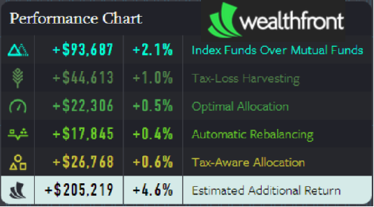
chart below from their website shows an investor who has $52k of greater wealth due to a 0.93% additional compound growth rate on investments due to "tax alpha" for capital loss harvesting - i.e., they literally project future wealth to grow at an extra 0.93%/year of annual return based on their estimated tax alpha.
However, the problem, as we now know, is that they are failing to disclose that the red line in the chart below - the greater value due to systematic loss harvesting - would have a substantially lower cost basis than the blue line and a much larger embedded capital gain that would wipe out virtually all of the differential, as already shown in the figure earlier (in other words, the Wealthfront illustration below only shows the gross value of the two lines and not the different cost bases and significantly different embedded tax liabilities associated with each). And of course, this also ignores the fact that as previously shown, the true economic return differential isn't ~1% of tax alpha in the first place, but closer to 0.09% instead (which is the outcome once the fact that the two lines have substantially different cost bases is accounted for).

Similarly, the Wealthfront home page explains their economic value as shown below, again implying an additional average annual growth rate of 1.0% attributable to tax loss harvesting, even though the true economic value should be no more than a fraction of that even at top tax brackets, and even less for what Wealthfront itself proclaims is their "typical" investor - a millenial engineer who has $90,000 invested with them... and isn't likely facing a marginal tax anywhere rate near the top tax brackets. And of course, that assumes the investor is using a taxable account in the first place, and not a retirement account where the built-in tax deferral means there is no value to tax-loss harvesting (though Weatlhfront's charts do not exactly make it clear that the benefits apply exclusively to brokerage accounts).

In addition to all these concerns, there's also the simple fact that the Wealthfront tax loss harvesting alpha is even further overstated by their choice of time horizons for their hypothetical back test. As their own charts show, the bulk of tax loss harvesting value is created in the midst of significant bear markets, while no tax alpha is produced in bull markets (and in fact the tax alpha can even be negative as rebalancing trades trigger capital gains recognition in the midst of an extended bull market with no available losses to harvest). Thus, Wealthfront's backtest starting point of the year 2000 is notable. Had they backed it up to start in the early 1990s instead, nearly doubling the length of the time period but with a long bull market that would have produced negative tax alpha for a decade and few opportunities to produce positive tax alpha, that alone would have cut their annual tax alpha by as much as 50% (as the same benefits from two bear markets would have been averaged over twice as many years), dropping it to little more than 0.50% and the true economic value (still assuming an 8% growth rate) to only about 0.05% (or no more than 0.02% or 0.03% per year with more realistic tax bracket assumptions). Notwithstanding their cherry-picked time horizon, it's also notable that on a net basis, even with their approach and favorably-chosen time period, the tax loss harvesting strategy has actually produced virtually no "tax alpha" since 2004, as the one positive year in the past decade - 2008 - was entirely offset by the negative tax alpha in 2007 and 2009 (because their rebalancing slowly started to force them to recognize some, but still not all, of the giant embedded tax liability their strategy is creating).
In the end, it's worth noting that none of this is meant to suggest that tax loss harvesting is a bad thing to do. With the exception of doing it so extensively that it drives up future tax brackets - or for those who are currently eligible for 0% capital gains rates - it does have
some value, especially if it can be implemented systematically and inexpensively (as many advisors have already been doing for a decade
on an automated basis with rebalancing software like iRebal and long before that with "manual" spreadsheets). And frankly, Wealthfront's tax loss harvesting capabilities
are unique, in that their platform allows daily tax-loss harvesting to be executed without any net transaction costs to investors, a substantial difference from advisors where
even low transaction costs do increase the friction of implementing loss harvesting strategies.
Nonetheless, the loss harvesting value must be measured on the basis of the true economic benefit, not the gross tax savings as a misrepresentative form of "tax alpha", should be done with realistic tax assumptions for the client (and not overstated with tax assumptions that clearly exceed what is known to be the average client), and especially should not be converted into an annual return that's assumed to compound for 20 years without accurately characterizing the tax results throughout the time horizon or at the end in the form of the growing embedded gain that the strategy creates.
Where Does Wealthfront Go From Here?
Nonetheless, one might expect that a technology company which is built on the basis of having savvy mathematical algorithms control your portfolio would know how to do the arithmetic of tax
and cost basis calculations properly, yet this error has remained in their tax loss harvesting white paper for nearly a year. Perhaps this is the problem with trying to build an "online financial advisor" platform with savvy tax strategies using only
an Investment Team and
sharp engineers but without actually having a CFP or CPA in a high-level advisory or leadership position? And lest anyone think this is just picking on a robo-advisor out of the blue, it's worth noting that I've pointed this issue out to the Wealthfront leadership repeatedly over the past year to give them a chance to fix it, yet the issue has remained unaddressed and unresolved.
And then again later last year after
an article by Felix Salmon that inappropriately extolled their overvalued tax alpha calculations:
From a broader perspective, the fact that Wealthfront has been drastically overstating the value of its tax harvesting strategy doesn't make the presence of such "robo-advisors" irrelevant. In fact, I've repeatedly noted that robo-advisors like Wealthfront, along with its similar counterpart
Betterment, are
steadily commoditizing the core construction of a passive, strategic portfolio for investors, which is a genuine cost-reduction value for consumers and will force advisors to continue to evolve to a more genuinely-personal-advice-centric value proposition. And while the reality is that many advisors
have been doing this with their own software for nearly a decade already - no matter what the robo-advisors claim, their implementation of these strategies using technology is not new nor unique - the 'robo-advisors' are finding ways to potentially make it even more efficient, especially through their quasi-pooled investment structures that are allowing them to execute transactions for clients without needing to apply any separate/additional transaction costs (how they actually do this is a conversation for another day).
Yet at the same time, this entire exercise illustrates perhaps the greatest weakness of Wealthfront: that developing broad-based algorithms for investment purposes can miss out on the nuances of individual tax planning - an entirely different core competency that must be integrated into the picture, as advisors routinely do and "robo-advisors" are still struggling to do. The situation is especially true given that Wealthfront will harvest losses for all clients on an ongoing basis, regardless of the fact that for some doing so will eventually drive them into a higher tax bracket and destroy wealth, while for others it should not be done at all because they're young and in the lower tax brackets and eligible for 0% capital gains rates and consequently harvesting gains is the best strategy for them. These are the exact kinds of nuances that good advisors can address when doing client-specific personalized financial advice that is beyond at least today's algorithm-based robo-advisors broad-sweeping investment implementation. In other words, Wealthfront's failings in this regard demonstrate exactly why some investors that need more individually-suited tax-sensitive advice must be cautious of a robo-advisor that looks solely at investments and fails to take into account the whole personal financial planning picture.
But who knows, perhaps this article will just propel Wealthfront forward to improve their offering, and bring even more attention to them, because there's no such thing as bad press, right?