Friday, March 28, 2014

Why Value Investing is So Hard (Russian Edition)

For every investing strategy there needs to be a fundamental reason why it works.  A basic, “explain to your 12 year old niece reason why it works”.  Value investing, at its most basic, is buying $1 for $.80 (or less than intrinsic value).  Most of the alpha out there (or smart beta or whatever it is being called these days) is either hard to find or hard to DO.  And by do, I mean it goes against everything your behavioral instincts tell you to do.  Buying a stock at all time highs is hard to do, and one reason momentum and trend work.  Buying a value investment is hard for many reasons, a few of which I outline below with a very relevant current example, Russian stocks.

1.  All of the headlines are negative.

2.  The investment has declined, usually by A LOT. 

3.  All of the trailing fundamentals are really bad.

4.  People can find many reasons why “this time is different” for the value metrics not to be reflective of the current situation.

5.  There is a non-zero risk of the investment going to zero.

6.  It is not popular (or patriotic) to own the investment.  

7.  Buying the investment, and it going down more,  would pose serious career risk. (or divorce risk).

8.  The banking consensus is all sell rated.

9.  Flows are out.

Russia checks all of these boxes and then some.   

For the same reason we recommend to never put all your eggs in one basket with a single stock, the same goes for countries too.  If you plan on value investing with countries it makes sense to buy a basket rather than just one or two.  As was the case with Greece going to a CAPE of 2 in 2012, Russia could easily get cut in half again.  But secular bears set the stage for secular bulls, and vice versa.  

Thursday, March 27, 2014

401(k) and the Passive Investment Revolution

Has the game between active and passive investment already been lost on the 401(k) field?

Over the past decade, the investment game has changed for 401(k) plan members, with passive strategies winning the latest round, a survey has found.
Vanguard, a predominantly passive investment manager, published a report this week showing a 51% relative decline in pension scheme members who exclusively used active strategies to manage their 401(k) plans.
“In 2004, 39% of participants were invested exclusively in active funds. By 2012, this all-active group had dropped to 19%,” the report said. “Conversely, in 2004, 10% of participants were invested solely in index funds. By 2012, that figure was 38%, a nearly fourfold increase.”
For those using a blend of the two approaches, Vanguard found passive strategies had won out. In 2004, some 30% of 401(k) assets were invested passively; by 2012, this had increased to 60% of the entire portfolio.
The difference in approaches is starkly displayed when looking at who is doing the investing.
Some older 401(k) plan members remained 100% invested in active strategies, which Vanguard attributed to “inertia”. Younger investors often had 100% passive strategies in their plan, “largely because they were automatically enrolled in plans with index-based target-date funds as the default investment,” Vanguard said.
Employers and plan sponsors have played a significant part in this structural shift, Vanguard added: “In recent years, more index funds—primarily indexed target-date funds—have been added to plans because of the sponsors’ desire to reduce participants’ investment costs and exposure to active fund risk.”
Vanguard also found a shift out of funds that were non-indexable, such as money market funds over the 2004 to 2012 period. These options used to make up 32% of an average portfolio in 2004; by 2012, they made up just 19%.
This month, a study by professors at Yale School of Management and the University of Virginia found 16% of young US investors would be better off opting out of their 401(k) plan and saving for retirement in a retail index fund.

The Disappointment of Hedge Fund ETFs

Hedge Fund ETFs continue to disappoint investors, but allocation remains on the increase.

Investors allocating to ETFs that track hedge fund strategies have reported another disappointing year, data from academics at EDHEC has found.
Less than 35% of users of this class of ETF reported they were satisfied with its performance in 2013. This level of satisfaction had already dropped over 2012 to 40% from a record high—for this asset class—of 65% in 2011.
In comparison, users of equity-bases ETFs have reported a 90% or higher satisfaction level since EDHEC began issuing its ETF Survey in 2006. By the end of 2013, these equity ETF users reported a 98% satisfaction level.
“These investment products enable investors to gain simple access to alternative investment opportunities such as hedge funds, commodities, real estate, or infrastructure,” the EDHEC report explained. “ETFs on alternative asset classes allow investors to diversify portfolios but do not require the infrastructure needed for direct investments and manager selection in alternative asset classes, infrastructure they may be unfamiliar with.”
The pull of these investment tools are clear, and investors have increased their allocation them rapidly, EDHEC said. In 2006, less than 10% of investors reported using hedge fund ETFs; in 2013, around 41% said they had an allocation to them. This is also due to a proliferation of new products, EDHEC said, adding that what attracted investors to the product may also be the cause of their frustration.
“ETFs in the alternative investment universe must deal with illiquid underlying assets, an obligation at odds with one of the main objectives of ETFs, that is, to provide high liquidity,” the report continued. “As a result, ETFs must usually rely on liquid proxies of the asset class that can only approximate the price movements in these asset classes.”
Hedge fund ETFs can rely on hedge fund factor models that make it possible to replicate the performance of broad hedge fund indices by investing in more standard and thus more liquid assets. To ensure the liquidity of the ETFs, only hedge fund managers who are active in strategies known for their liquidity are selected, EDHEC said.
For real life hedge funds, 2013 was a positive year, but as a group the strategies failed to outperform the S&P 500. Hedge funds recorded their best performance in three years in 2013, largely due to the strong equity market, ending the year with a 9.2% return, data firm eVestment found. In contrast, the S&P 500 rose more than 26%.
Investors reported only sustainable, responsible investment-based ETFs were more disappointing in 2013.
To read the full report, produced in association with Amundi, click here.

Examining Long-Short Mutual Funds vs. Long-Short Hedge Funds


The growth of liquid alternative mutual funds has continued at a rapid pace, and with this growth many advisors and other asset allocators have asked the question of whether the product they can access in a mutual fund is equivalent to what is available in a private hedge fund. David McCarthy, a long-time hedge fund practitioner (and part time academic researcher) asked the same question, and also set out to find the answer. His findings are published in a paper titled “Hedge Funds versus Hedged Mutual Funds: An Examination of Equity Long/Short Funds” in the Winter 2014 edition of The Journal of Alternative Investments.
McCarthy has been around hedge funds for over 25 years and is currently the Principal of D.F. McCarthy LLC, a consulting and advisory firm. Prior to this, he co-founded in 2002 Martello Investment Management, a fund of hedge funds and advisory firm and, among other roles, he also served as an Investment Manager for Global Asset Management (GAM) where he managed the firm’s trading based fund of funds.
As part of his work for this particular study, McCarthy evaluated the full list of mutual funds that were included in Morningstar’s Long/Short Equity category as of January 2013, and pared down the universe from 83 funds to 55 funds that fit his definition of a long/short hedge fund. From this group of 55 funds (47 were open for new investments at the time, and 8 were closed), McCarthy began his work.

The 4 Key Findings

I recently had the opportunity to speak with McCarthy about the paper and some of the key findings from his research that are outlined below. At the end of the article, you will find a link to an abstract of the full article, plus a link to the full article on the The Journal of Alternative Investments’ website.
Key Finding #1: Equity Long/Short Mutual Funds and a Sample of Equity Long/Short Hedge Funds Held Similar Actual Equity Exposures as of the Period of Analysis.
It is often thought that mutual fund constraints place restrictions on managers and limit their ability to implement their strategies the same way they would in a private partnership structure. It turns out that is not the case, at least not with long/short equity funds. Long exposures within long/short mutual funds are very similar to those in hedge funds, and short exposures are also similar after correcting for long/short funds that don’t short physical securities.
According to McCarthy, thirteen of the long/short managers did not have any physical short positions at the time of the analysis. He noted, “This is an area where a financial advisor should ask the managers why they don’t have any short positions, or look more closely into the fund and find out if the short positions are being implemented through options or some other derivative instruments.” Excluding these thirteen managers, the mutual funds had very similar short exposure to the representative group of hedge funds used in the analysis.
Key Finding #2: Quantitative Analyses of Equity Long/Short Mutual Funds and Leading Equity Hedge Fund Indexes Showed No Substantial Factor Exposure Differences.
What are the mutual fund managers buying and investing in? Is it the same thing as the hedge fund managers? Yes, as it turns out. McCarthy looked at the factor exposures, such as beta, size, book to market value and momentum, and found no meaningful difference between the factor exposures in mutual funds versus those in long/short hedge fund indices. One slight difference noted was a higher variability of market beta in the hedge funds, which might be accounted for by their more active and/or aggressive positioning around changes in the market environment. The long run beta of the two groups of funds tended to be similar however.
Key Finding #3: Return/Risk Analyses of Equity Long/Short Mutual Funds and Leading Indexes of Equity Long/Short Hedge Funds Showed No Substantial Performance Differences.
This is where the rubber meets the road. Can mutual funds deliver on performance? Here again, the answer is yes. Over the time period reviewed, which was from January 2008 through June 2013, mutual funds delivered performance that was in-line with the returns of major hedge fund indexes. Over this 5.5 year time period, the group of long/short mutual funds generated an annualized return of 0.9% with an annual standard deviation of 9.4%, while the HFRI Equity Hedge Fund Index returned 0.8% with a standard deviation of 10.5%.
This key finding is especially true when isolating the performance of products from large, diversified firms (see Key Finding #4 below).
Key Finding #4: Segmenting Equity Long/Short Mutual Funds by Sponsoring Firm (i.e. Diversified Investment Firm versus Specialized Investment Firm) Did Result in Observed Performance Differences.
One surprising finding was that products from larger, diversified firms tended to perform better than products from more focused firms. Strategies from the diversified firms tended to have higher betas and more volatility, but over the full time period generated returns that were about 2.5% better annually. The one significant exception was in 2008 when the more focused firms lost about 10% less than the products from the more diversified firms, which is partially accounted for by the lower betas of the funds from the more focused firms.
McCarthy admitted that the sample size for this finding was small, with only 9 managers fitting into the diversified firm bucket, but he also noted that there might be some meaningful insights to be gained when looking deeper into this point. Portfolio managers at larger, more diversified firms that launch new products might typically be some of the best managers in those firms. These new products help keep the managers engaged and growing in their career, which in turn may keep them from jumping ship to what could potentially be a more lucrative (and potentially more volatile) job with a hedge fund. Interestingly, this finding is similar to that found in a recent academic study noted on Morningstar in an article titled “More Cooks Improve the Broth.” In that study, they found that team managed portfolios, as well as those from larger fund families, generated better performance than their counterparts.
Bottom line: check the pedigree of the portfolio manager and/or the team managing the strategy. Think about the resources they have available to them and why they launched their strategy in a mutual fund.

More Category Evaluations to Come

McCarthy will be working through and evaluating other alternative categories including the multi-alternative, market neutral and managed futures categories. We will be sure to publish his findings when they are made available. In the meantime, the abstract and full articles can be found using the links below.
A copy of the article abstract can be downloaded here: Article Abstract – Hedge Funds versus Hedged Mutual Funds

Emerging Markets Are Attractive


Chart 1: Fund managers are extremely underweight Emerging Markets
Merrill Lynch Fund Managers GEMs Weighting Source: Short Side of Long
In the recent Merrill Lynch Survey for the month of March, fund managers reported largest underweight position on Emerging Market equities since inception. Managers are currently underweight this equity region by -31%, which is almost 3 standard deviations away from a decade long average. That is quite a bearish sentiment reading right there! As readers can see from the chart above, fund managers were overweight GEM equities by +43% in February 2013 but nervously switched this position quite rapidly over the last year.
Chart 2: Cash balance levels have increased due to GEM equity sell off
Merrill Lynch Fund Managers Cash Balance Source: Short Side of Long
Not only are fund managers currently extremely underweight this region, after being highly exposed to it only a year ago, but they are also rising their cash levels as Global Emerging Markets (GEMs) equities disappoint. The fact that cash balance levels highly correlate with GEM Equity lets us know that majority of the managers had high exposure to regions outside of US and EU just until recently.
In the chart above, there is a possibility in coming months that GEM Equities might technically break down from the current consolidation zone, at which point cash balances would rise towards 1.5 standard deviations away from mean and indicate a contrarian buy signal. Similar setup was seen during the 2008 and 2011 crashes, were cash levels spiked pretty quickly.
Chart 3: Emerging Market stocks are cheap & ripe for buying pretty soon
GEM Equities PBV Source: Barclays Research
Some of you are wondering, with all of the negative media coverage, why in the world should one buy Emerging Market equities?
Well, the answer is precisely because everyone dislikes them so much. Even more importantly, GEM Equities are starting to look extremely attractive from long term valuation standpoint. Last week, the overall MSCI EM Index traded at 1.4 price to book value, cheapest since the depths of the Lehman panic in 2008. As we can see in the chart above, that is usually a buy zone (even though I personally think that P/BV could fall closer towards 1 before the major low is in).
Having said that, plenty of Emerging Markets are already trading close to or even below book value including South Korea, Brazil, Russia, Egypt, Czech Republic, Poland and many others. Even China is trading at 1.4 times book value, which is relatively much more attractive then the overvalued and euphoric US market.

A Commodity Story


On a relative performance basis we continue to find a discretely transitioning market environment, led by the move in commodities - which first tipped its hand last year in the precious metals sector. While Goldman was out this week (see Here) casting causations at the foot of weather for the strength in gold over the past few months, we see things quite differently and from a more methodical and endogenous perspective. From our point-of-view, these developments - namely the bid in precious metals, commodities and now emerging and Chinese equity markets, has been a long-term cyclical development and not an impulse driven phenomenon. 


Although gold and silver continued their retracement declines in the wake of another taper, we expect these moves will reverse in the near-term and still favor the asset class and their respective miners.  


As we pointed out in previous notes (see Here), on a very long-term horizon the CRB relative to equities tested the secular low and found strong support. While the consecutive tapers by the Fed has provided monthly anxieties towards the investment thesis, the broader takeaway has seen assets tied to rising inflation expectations strengthen as the Fed moves further away from their extraordinary accommodative policies. 

This has been borne out as well in the currency markets at the expense of the US dollar, which has provided a tailwind to the euro and those currencies derivative of commodity market strength. Framed in a strongly inverse relationship, the current long-term disposition between the CRB and the US dollar index sits at a relative equilibrium within its narrowing range. We continue to expect that the US dollar will break down out of this equilibrium - as the CRB turns higher from its recent cyclical low.


The euro has benefited from both the long-term cyclical trends in the US dollar - as well as the underlying and more structural deflationary forces prevalent today in the eurozone. This morning we received the latest indication that the ECB was considering a less traditional approach to mitigating the "excessively low" inflation conditions. Erkki Liikanen, Finland's central bank governor was quoted as saying, "If you want to tackle the issues with traditional monetary policy, then you should be able to cut rates further. We are at low levels but we haven't exhausted our maneuvering room." He went on to say, "The question of negative deposit rates, in my mind, isn't any longer a controversial issue." Similar to Draghi's comments a few weeks back and a microcosm of the broader troubles facing weakening the currency, the euro momentarily sold-off - but recovered swiftly.   

Our expectations of a cyclical low in emerging markets (EEM) and Chinese equities (SSEC) - relative to the SPX, is finding greater traction this week and now presents a positive performance throughout the month of March. Peripheral to these developments is the fact that the CRB relative to the SPX has returned ~ 6% this year, while gold relative to the SPX is up over 7.5%. 

As much as we recognize the wide performance divergence between emerging market and Chinese equities and their respective bond markets, a more simple explanation is that the longer-term prospects of these sectors still have further road to travel - as evident in the dogmatic institutional fingerprints that have yet to abandon the story. Considering our longer-term impressions on the commodity sector, it makes logical sense to infer at the very least a relative strength developing in emerging markets - which often derive significant support from the broader commodity story.


Click to enlarge images


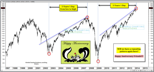
5 Years and 1 Day....

The SPX rally from ‘02-‘07 lasted five years and one day.  Take a wild guess how long the current bull ran?  Yep, five years and a day.  
Breaking it down a little more, each of those rallies lasted exactly 1,260 days.  Scary stuff, huh?  


Wednesday, March 26, 2014

Industrial Commodities Update

Chart 1: After a 3 year downtrend, Copper is moving into a panic sell off
Copper vs 200 MA Source: Short Side of Long
…Agricultural sector of the commodity index is finally starting to bottom out. And since agriculture makes over 40% of the CRB Index, it was one of the main reasons behind this weeks breakout.
Those exposed to Agricultural commodities have benefited over the last quarter, with Sugar and in particular Coffee outperforming S&P 500 by a large margin. However I also stated that Agricultural rally on its own is not enough to confirm a commodities bull market.
…it is important to get confirmation from the economically sensitive commodities before one should take a bullish stance. For example… Copper and Brent Crude are yet to break out of their respective downtrends.
Copper is one of the most important metals in the building sector and a great barometer of the overall Industrial Metals space, which has also not broken out yet. Moreover, Brent Crude Oil is a better gauge of global Oil prices relative to West Texas Intermediate Crude and a great indicator of the global economic activity.
In Chart 1 seen above and Chart 2 seen below, we can see that these important industrial commodities are NOT confirming the rally. Copper has already broken down and most likely moving into its final panic sell off after a 3 year bear market. On the other hand, Brent Crude has consolidated for three years and also should drop into oversold levels before one considers a bottom to be in place.
A strong sell off in both of these commodities could be a bullish signal that a final wash out has occurred. Rarely do bear markets go on for more than three years without a meaningful rally (this outlook goes for many commodities, majority of which peaked between early to mid 2011).
Chart 2: Brent Crude is at a decision point and a breakdown looks likely!
Brent Crude Oil Technicals

What’s a Five-Star Fund Worth? Baird Study Suggests Not Much


Focus on Funds hears plenty of grousing from capable fund managers these days. The managers complain they can’t gather new investor money unless Morningstar awards them a four- or five-star rating.
And it’s true: Lots of investors won’t look at a fund unless it has the accolade.
Here’s what the ostensibly picky investor might not realize. The “stars” are purely backward-looking. Morningstar’s “star ratings” measure a fund’s past risk- and load-adjusted returns versus peers. That’s it.
Past performance is not just the subject of oft-repeated gibberish in your fund’s ignored disclaimers. It’s also — at least when it comes to future returns in stock funds — very close to useless.
That, at least, was my initial thought on the subject when I read a study by R.W. Baird on Morningstar’s star-rating system — more on the subject below. I thought of it because S&P Dow Jones Indices‘ studies on “persistence” find precious little evidence that fund managers can sustain high performance over time.
So few high-performing mutual funds stay in the high-performing group, in fact, that you’d expect more just by random chance, S&P has found. So throw out past performance as a predictor.
But while “useless” may apply to historical returns, it’s overstatement to apply the term (as I did in the first version of this blog post) to use it for risk-adjusted returns, which appear to show some persistence. Morningstar has found on the basis of eight years’ returns “mildly predictive” evidence that funds with strong risk-adjusted returns tend to deliver somewhat better-than-average returns in the future.
Of course, one way to sidestep the question is simply to use Morningstar’s other rating system — the “analyst ratings” — if you need a shortcut. These ratings give goldsilver, orbronze awards to the funds deemed by Morningstar to possess the best investment processes and other attractive attributes. It’s a qualitative judgment.
Making a reasoned judgment on something besides juicy numbers is indispensable.
Now here comes R.W. Baird & Co. with a study that, at first glance, is consistent with the idea that past performance is less useful than a professional fund analyst’s independent judgement — or, better yet, your’s, or your adviser’s.
Baird’s study attempted to test out the idea — on which many investors appear to act — that five stars means “attractive.” They grouped mutual funds by the number of Morningstar stars they possessed at the beginning of three distinct three-year periods from 2005-2013, a process which yielded 4,400 data points.
Result, for U.S. stock funds: A high rating corresponds in the Baird study to underperformancefor the three year period. Meanwhile, one-star funds — the recent bums — outperformed the five-star ones by an average of 146 basis points. As the Baird authors put it: “Interestingly, five-star funds not only underperformed one-star funds,” they write, but “they performed the worst of all categories.”
Here’s where it gets interesting. What I failed to realize when I first published this blog post is the importance of certain methodological choices which turns out to have an effect on the study’s result. These are, prominently, the choice of three static time periods instead of rolling ones, and the failure to correct for survivorship bias. Factors such as these appear to have made the results look worse for high-rated funds than they’d otherwise be.
One reason: the type of investing strategies which worked well from 2005-07 were, for instance, much different from the successful strategies during 2008-2010, due to starkly different market conditions. So you get a choppier result than you would have with rolling time periods and the richer data sample they introduce.
Bond funds, the big, favorable exception in Baird’s findings, may actually underscore how market conditions can drive the data. What worked in bonds over this period was fairly constant, so taking the snapshot without rolling periods gave the same result Morningstar has previously found: High rankings are “mildly predictive” of future returns.
The power of survivorship bias is another thing that matters that I didn’t factor in this afternoon when writing the first cut of this post.
The Baird study didn’t incorporate the returns of defunct funds, Morningstar’s John Rekenthalertold Barron’s, and defunct funds are disproportionately poor performers. “There’s a big pool of one-star funds, and 10% of them close in any given year,” Rekenthaler told Barron’s. “That’s not a small thing.”
Bring those poor-performing defunct funds back into the data and the 1-star returns will surely drop. By contrast, very few 5-star funds go defunct.
Rekenthaler’s overall assessment of the Baird study is that it is “pretty time-period dependent.”
The critiques weren’t disputed by the Baird author, Aaron Reynolds, when reached by aBarron’s editor earlier this week. Asked about the use of static time periods, Reynolds said, “We chose three mutually exclusive time periods because the results were more muddled when looking at rolling time periods. There was no great correlation you could come up with.”
So, what to make of all this? I take away a few things:
(1) Past performance without adjusting for risk tells you little about the future, so discount its importance when selecting an investment.
(2) There’s some evidence that risk-adjusted returns are associated with better-than-average future returns, but the evidence is not overwhelming.
(3) Even when watching risk-adjusted returns, include a qualitative approach. Data should inform the argument but the intuition and argument should make sense, too.
(4) In fund research, the devil is in the details — the methodology.

Profit Margins: The Epicenter of the Valuation Debate


James Montier of GMO, whose work I deeply respect and enjoy reading, recently put out awhite paper defending the Shiller CAPE from some of the attacks that have been waged against it.  He offered a number of strong arguments.  In this post, I want to focus on one argument in specific: the argument that because many valuation metrics, in addition to the Shiller CAPE, are sending signals of extreme overvaluation, that the signals are more likely to be accurate.
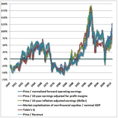
John Hussman makes a similar argument.  In a recent weekly comment, he put all of the metrics together onto a single chart:
hussmanchart
The suggestion is that these “independent” metrics, by speaking together in unison, bolster the reliability of the extreme overvaluation call.  But if you examine the metrics closely, you will notice that each of them conducts some kind of profit margin “normalization”, whether directly or indirectly.  The metrics either directly adjust earnings to reflect average historical profit margins, or they peg the market’s valuation to variables that track with the size of the economy, so that if the profit share of the economy changes, the effect on valuation is removed.  Each metric therefore hinges on the assumption of profit margin mean-reversion: the assumption that profit margins naturally gravitate towards aconstant mean–a mean that does not change as structural conditions in the economy change.
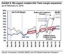
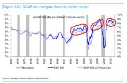
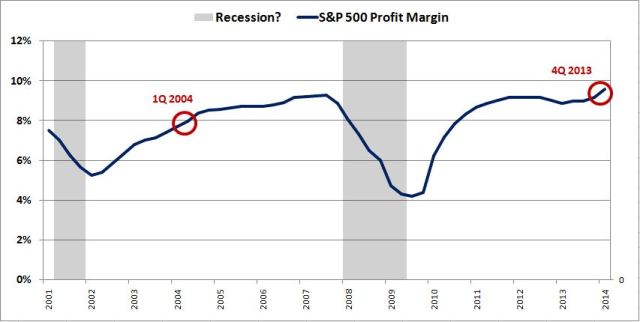
But what happens if this assumption turns out to be wrong?  Looking back, profit margins have resisted mean-reversion for quite awhile now.  If you use the profit margins that actually matter, S&P 500 profit margins, and you ignore brief recessionary periods, they’ve resisted it for almost 20 years.  The following charts show the trajectory of S&P 500 profit margins over time (the first chart shows pro-forma net margins, the second chart shows GAAP net margins, and includes the notorious writedown charges of the last two recessions):
ijajeklkbianco
As the charts illustrate, outside of recessions, profit margins have remained significantly above the long-term average for almost two decades.  Why ignore recessionary periods? Because no one disagrees that profit margins fall in recessions, that they are cyclical in nature.  The question is whether they are mean-reverting–specifically, whether they revert to a mean that stays constant over time.  If they spend all of their time elevated well above the mean, and only fall to touch it briefly during recessions, after which they rise right back up, then either they aren’t mean-reverting, or you’re not using the right mean.
Suppose that the White Queen comes down and tells us that over the next 10 years, profit margins are going to stay roughly near their current levels.  With the exception of a brief recession in which they fall and bounce back, they aren’t going to mean-revert, at least not to the average of any prior historical era.  Would these metrics, with their “independent” signals, be of any use in predicting subsequent 10 year returns? Hardly.  They would all fail together, because they would all be wrong on that one crucial issue–the issue of profit margins.  
The market sets prices based on how forward earnings actually look in the present moment, given the present trend, not based on how they would look under a set of countertrend, counterfactual assumptions.  If profit margins 10 years from now end up roughly where they are today, then assuming no changes in the P/E multiple (it’s fine), the total return will simply be the nominal sales growth plus the shareholder yield (dividends plus buybacks net of dilution).  For our low growth environment, we might conservatively estimate 4% to 5% for the nominal sales growth (this estimate would include inflation and the impact of a year or two of mild recession some time in the next 10 years), and 2% to3% for the shareholder yield, to produce an annual total return of 6% to 8%.  This return, if produced, would be perfectly healthy, normal, respectable, indicative of a market that’s appropriately priced, not a market at a valuation extreme.  
Now, what I’m saying here isn’t just conjecture: all of the metrics did fail together, when applied in a similar manner in the last cycle.  As we can see in John Hussman’s chart, ten years ago, in early 2004, the metrics all showed an extremely overvalued market–ranging anywhere from 50% to 100% overvalued.  But the actual long-term return that was produced from early 2004 to now was quite healthy–more than 7% per year.  And that was with the ugliest recession since the Great Depression sandwiched in the middle.
Why the miss?  Valuation bears will blame it on the fact that the current market is heavily overvalued, and that the overvaluation has caused the returns from 2004 to now to be artificially high.  But this point begs the question.  The market is only heavily overvalued ifthe metrics are calling things correctly.  Are they?
The market is priced at roughly 17 times trailing earnings–hardly an extreme.  The reason that the metrics missed has nothing to do with any abnormality in that multiple, and everything to do with the fact that profit margins didn’t mean-revert as assumed. Using S&P’s operating earnings compilation, at the end of the 1st quarter of 2004, the S&P 500 profit margin was just under 8.0%.  Instead of falling back to 5.5%, or to wherever the historical average is, it actually rose.  With the fourth quarter of 2013 now complete, the profit margin is 9.6%–a new record high.  The profit margin increase (from 8.0% to 9.6%) roughly offset the contraction in the P/E multiple (from 19.4 to 17.2) to produce a net total return of around 7%.
spxprof3a
It’s a mistake, then, to think that these normalized metrics somehow provide “independent” confirmation of each other’s accuracy.  In essence, they are all the same metric, expressed in different formulations.  What we have in the valuation debate are two metrics–one metric, with many different permutations, that will only work if profit margins fall significantly over the next several years, and another metric, with one permutation, that will only work if they don’t.  
Now, to be fair, valuation bears may end up being right in their extreme overvaluation call. Profit margins may fall significantly from here forward, leaving behind an extremely expensive market. If that happens, they will get the last laugh–and they will deserve it. But they are mistaken if they think that this call is backed by multiple “independent” sources.  It is not.  It hinges on one single macroeconomic thesis–a thesis that, so far, hasnot worked out, that could easily continue to not work out, and that if it doesn’t work out, will drag the entire edifice down with it.
In valuation-themed posts that follow, I intend to drop the corollary discussions about the Shiller CAPE and focus directly on this one issue, profit margins, the epicenter of the valuation debate.  I encourage valuation bears to do the same.  Let’s get to the point.  If profit margins are going to fall significantly over the next several years, I want valuation bears to convince me of it now, so that I can prepare for the inevitable downside.  And I hope the same is true in the other direction: that if profit margins are not going to fall, or if they are only going to fall moderately (my base case expectation), or–heaven forbid–if they are actually going to keep rising from here (a possibility that some analysts are arguing for), that valuation bears would want me and others to convince them of it now, so that they can restore their equity exposures to normal, or at least get more comfortable with the idea of buying the dips and corrections that this bull market offers going forward.

Sunday, March 23, 2014

The Problem With Forward P/E's


In a recent note by Jeff Saut at Raymond James, he noted that valuations are cheap based on forward earnings estimates. He is what he says:

"That said, valuations are not particularly onerous with the P/E ratio for the S&P 500 (SPX/1841.13) currently trading around 15.2x this year’s bottom-up estimate of roughly $121 per share. Moreover, if next year’s estimates are anywhere near the mark of $137, the SPX is being valued at a mere 13.4x earnings."
As a reminder, it is important to remember that when discussing valuations, particularly regarding historic over/under valuation, it is ALWAYS based on trailing REPORTED earnings. This is what is actually sitting on the bottom line of corporate income statements versus operating earnings, which is "what I would have earned if XYZ hadn't happened."
Beginning in the late 90's, as the Wall Street casino opened its doors to the mass retail public, use of forward operating earning estimates to justify extremely overvalued markets came into vogue. However, the problem with forward operating earning estimates is that they are historically wrong by an average of 33%. The chart below, courtesy of Ed Yardeni, shows this clearly.
Let me give you a real time example of what I mean. At the beginning of the year, the value of the S&P 500 was roughly 1850, which is about where at the end of last week. In January, forward operating earnings for 2014 was expected to be $121.45 per share. This gave the S&P 500 a P/FE (forward earnings) ratio of 15.23x.
Already forward operating earnings estimates have been reduced to $120.34 for 2014. If we use the same price level as in January - the P/FE ratio has already climbed 15.37x.
Let's take this exercise one step further and consider the historical overstatement average of 33%. However, let's be generous and assume that estimates are only overstated by just 15%. Currently, S&P is estimating that earnings for the broad market index will be, as stated above, $120.34 per share in 2014 but will rise by 14% in 2015 to $137.36 per share. If we reduce both of these numbers by just 15% to account for overly optimistic assumptions, then the undervaluation story becomes much less evident. Assuming that the price of the market remains constant the current P/FE ratios rise to 18.08x for 2014 and 15.84x for 2015.
Of course, it is all just fun with numbers and, as I stated yesterday, this there are only three types of lies:
"Lies, Damned Lies and Statistics."
With the continued changes to accounting rules, repeal of FASB rule 157, and the ongoing torturing of income statements by corporations over the last 25 years in particular, the truth between real and artificial earnings per share has grown ever wider. As I stated recently in "50% Profit Growth:"
"The sustainability of corporate profits is dependent on two primary factors; sustained revenue growth and cost controls. From each dollar of sales is subtracted the operating costs of the business to achieve net profitability. The chart below shows the percentage change of sales, what happens at the top line of the income statement, as compared to actual earnings (reported and operating) growth."
"Since 2000, each dollar of gross sales has been increased into more than $1 in operating and reported profits through financial engineering and cost suppression. The next chart shows that the surge in corporate profitability in recent years is a result of a consistent reduction of both employment and wage growth. This has been achieved by increases in productivity, technology and offshoring of labor. However, it is important to note that benefits from such actions are finite."
This is why trailing reported earnings is the only "honest" way to approach valuing the markets. Bill Hester recently wrote a very good note in this regard in response to critics of Shiller's CAPE (cyclically-adjusted price/earnings) ratio which smooths trailing reported earnings.
"More recently the ratio has undergone an attack from some widely-followed analysts, questioning its validity and offering up attempts to adjust the ratio. This may be a reaction to its new-found notoriety, but more likely it’s because the CAPE is suggesting that US stocks are significantly overvalued. All of the adjustments analysts have made so far imply that stocks are less overvalued than the traditional CAPE would suggest."
We feel no particular obligation defend the CAPE ratio. It has a strong long-term relationship to subsequent 10-year market returns. And it’s only one of numerous valuation indicators that we use in our work – many which are considerably more reliable. All of these valuation indicators – particularly when record-high profit margins are accounted for – are sending the same message: The market is steeply overvalued, leaving investors with the prospect of low, single-digit long-term expected returns. But we decided to come to the aid of the CAPE ratio in this case because a few errors have slipped into the debate, and it’s important for investors who have previously relied on this ratio to understand these errors so they can judge the valuation metric fairly. Importantly, the primary error that is being made is not even the fault of those making the arguments against the CAPE ratio. The fault lies at the feet of a misleading data series."


If I want to justify selling you an overvalued mutual fund or equity, then I certainly would try to find ways to discount measures which suggest investments made at current levels will likely have low to negative future returns. However, as a money manager for individuals in retirement, my bigger concern is protecting investment capital first. (Note: that statement does not mean that I am currently in cash, we are fully invested at the current time. However, we are not naive about the risks to our holdings.)
The following chart shows Tobin's "Q" ratio and Robert Shiller's "Cyclically Adjusted P/E (CAPE)" ratio versus the S&P 500. James Tobin of Yale University, Nobel laureate in economics, hypothesized that the combined market value of all the companies on the stock market should be about equal to their replacement costs. The Q ratio is calculated as the market value of a company divided by the replacement value of the firm's assets. Currently, the CAPE is at 25.41x, and the Q-ratio is at 1.01.


Both of these measures are currently at levels that suggest that forward stock market returns are likely to be in the low to single digits over the next decade. However, it is always at the point of peak valuations where the search for creative justification begins. Unfortunately, it has never "been different this time."
Lastly, with corporate profits at record levels relative to economic growth, it is likely that the current robust expectations for continued double digit margin expansions will likely turn out to be somewhat disappointing.


As we know repeatedly from history, extrapolated projections rarely happen. Therefore, when analysts value the market as if current profits are representative of an indefinite future, they have likely insured investors will receive a very rude awakening at some point in the future.
There is mounting evidence, from valuations being paid in M&A deals, junk bond yields, margin debt and price extensions from long term means, "exuberance" is once again returning to the financial markets. Again, as I stated previously, my firm remains fully invested in the markets at the current time. I write this article, not from a position of being "bearish" as all such commentary tends to be classified, but from a position of being aware of the "risk" that could potentially damage long term returns to my clients. It is always interesting that, following two major bear markets, investors have forgotten that it was these very same analysts that had them buying into the market peaks previously.


Originally posted at Lance's blog: STA Wealth Management
(c) STA Wealth Management
stawealth.com


Print Page    Email Article
 
Remember, if you have a question or comment, send it to editor@advisorperspectives.com.
© Copyright 2014, Advisor Perspectives, Inc. All rights reserved.

Lunch is for wimps

Lunch is for wimps
It's not a question of enough, pal. It's a zero sum game, somebody wins, somebody loses. Money itself isn't lost or made, it's simply transferred from one perception to another.